
INSPIRATION: HANNES JÄHN, BOOK DESIGNER

Over at The Counter Press, we’ve recently invested in a collection of new metal type, freshly cast by Rainer Gerstenberg—one of the few people still casting foundry type (see Eye magazine ‘The last man casting’). The choice of metal type available these days is relatively limited, especially compared to the almost endless choice of digital typefaces. And unlike digital type, it’s expensive, heavy and takes up a lot of room, so it’s a big decision to make. After some deliberation, the typeface we chose was Diethelm, a design created in 1940s by Walter Diethelm for the Haas Type Foundry.
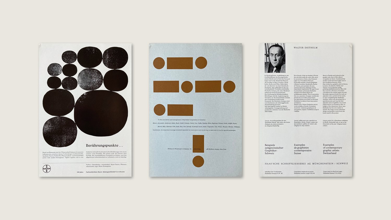
The next decision was which point sizes to buy? This isn’t like buying a font for use on computer, where you can scale up or down almost infinitely, in metal type you need to pick the exact sizes you want to be cast. To help us choose, we borrowed an original physical type specimen from the archive of typographer and printer, David Wakefield.
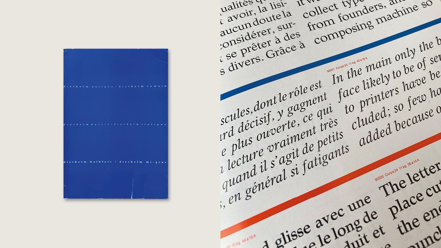
Tucked in the back of the specimen were printed examples using Diethelm from various designers of the period. Of course there were designs from the likes of Paul Rand, but there were also some different names that I’d not heard of, and in some cases neither had the internet! But one in particular did appear in our searches, Hannes Jähn. Although we couldn’t find much, what we did find we liked…
Born in Leipzig, Jähn trained as a signwriter in the Hans Patze workshop, where he earned the Stalin certificate as the ‘fastest sign painter in Leipzig’. With that accolade in his pocket, Jähn went on to train as a graphic designer in Cologne, becoming a book designer and working with no fewer that 49 publishers over the rest of his career. He died in 1987, leaving behind an amazing design back catalogue, all showing a sensitivity to image and type, that could be playful or elegant, quietly serious or brash and bold, depending on what the content needed. Each piece is a thing of beauty and you can easily lose a few hours trawling through Abe Books looking for his cover designs. Here are a few of my favourites.


Type only covers from the Sammlung Luchterhand paperback series from the early 1970s. See more at Fonts in Use