LOCKDOWN LETTERS

LOCAL LETTERING DISCOVERIES
During lockdown, like everybody else, we’ve been taking a lot of walks locally. We’re lucky enough to have beautiful countryside on our doorstep, but as graphic designers, we’re always on the look out for interesting bits of lettering.
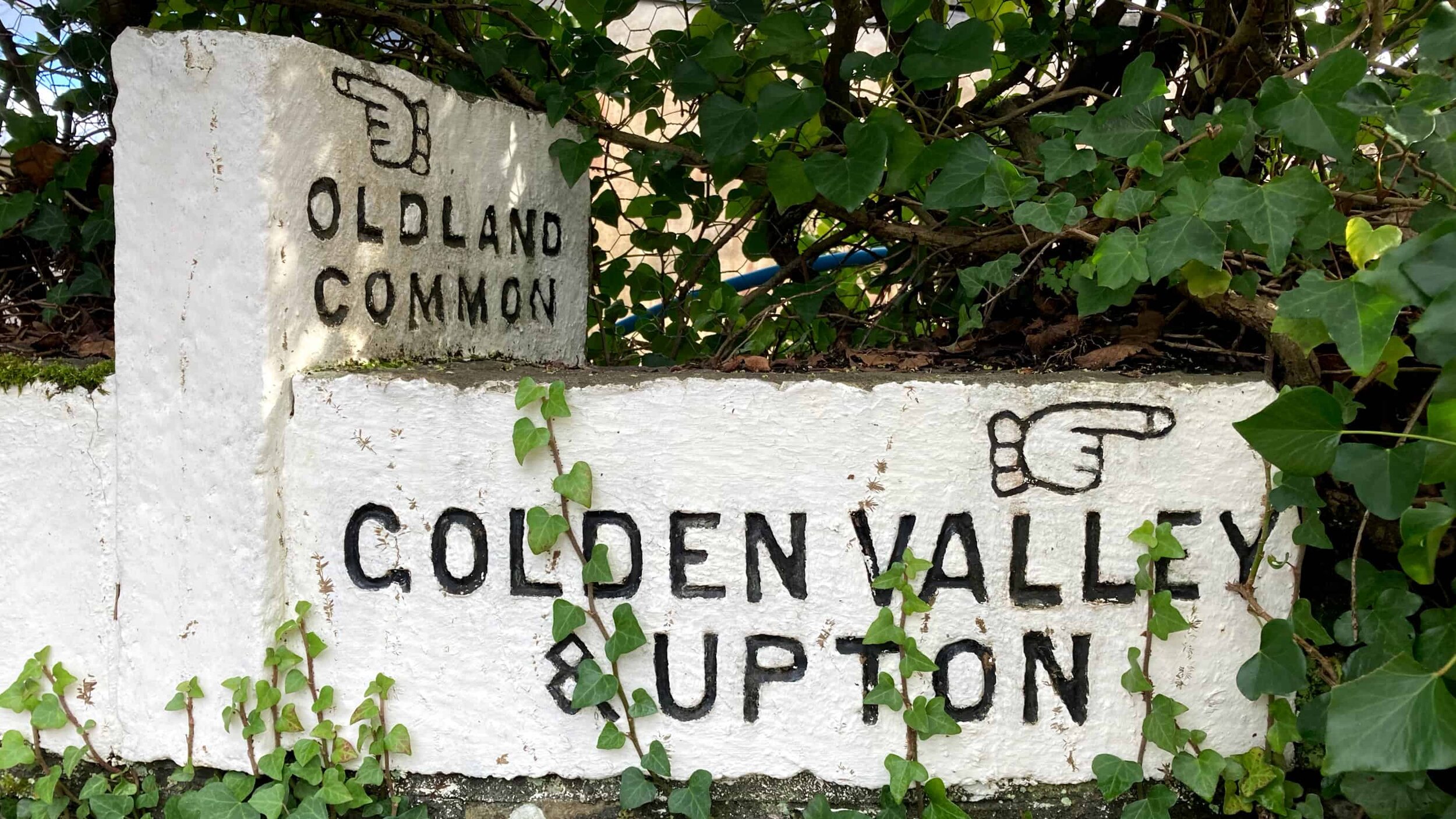
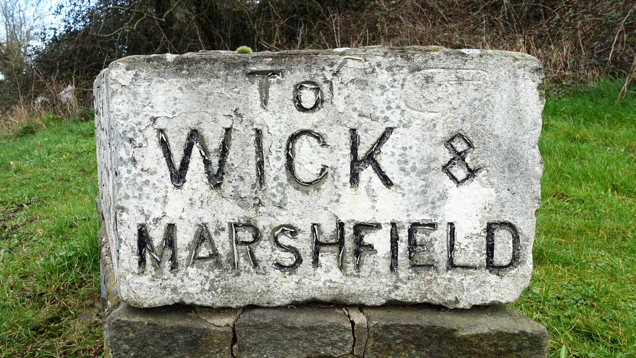
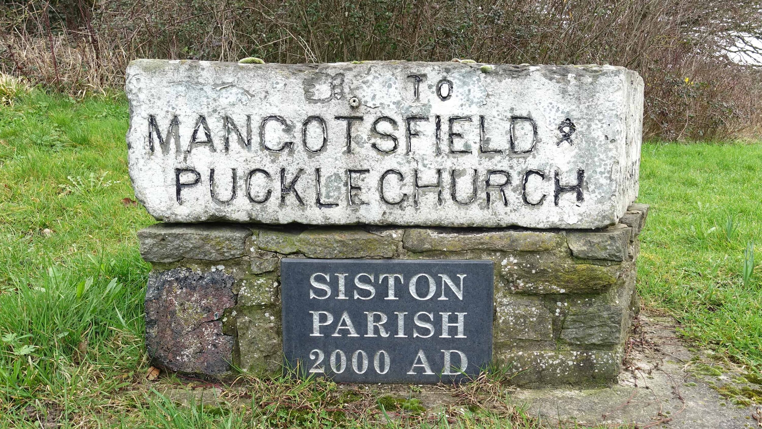
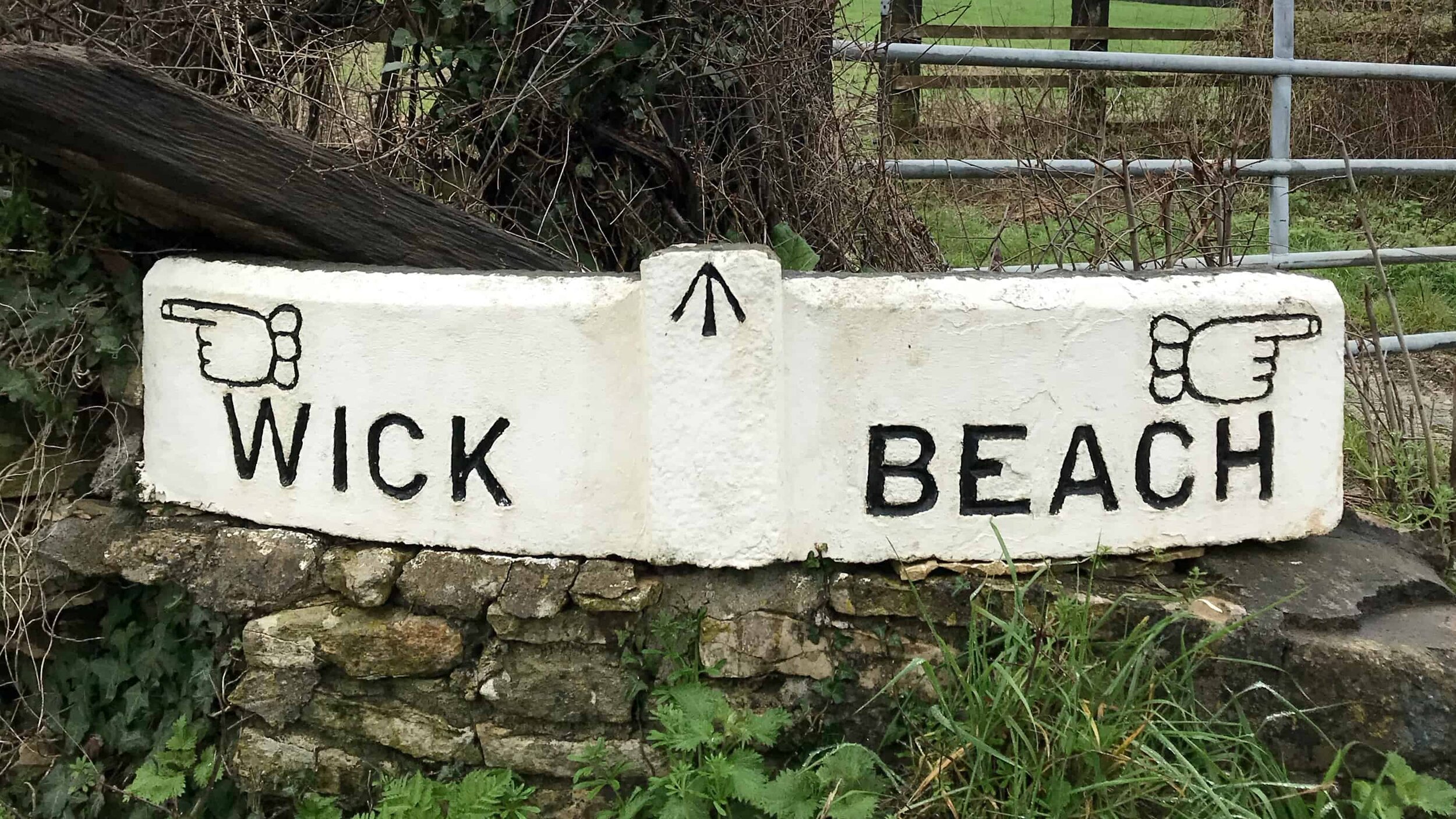
So it’s been a nice distraction to discover that the villages and lanes all around us have a collection of simple and striking old directional signage—or waystones. Some have seen better days and better paint jobs, but a little research has led to the discovery that they are Grade II listed and an important part of the area’s heritage.
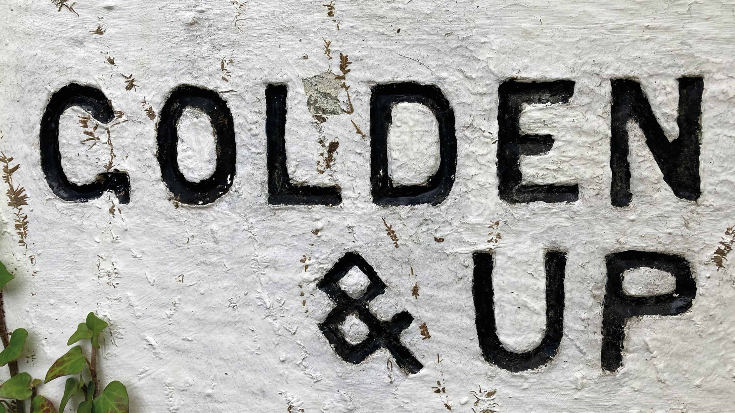
For the most part, the waystones have unadorned, minimal mono-line letters crudely cut into chunks of stone, then painted black and white. But to balance this simplicity there is often an almost frivolous addition of a manicule, with a frilly little cuff, pointing you in the right direction.
One day perhaps we’ll find the time to make them into a typeface.