
FONTSMITH FAVOURITES
This time last year our client Fontsmith was acquired by type giants Monotype. For typophiles like us it had been a dream collaboration for over 5 years, during which time we were lucky enough to work on some great projects, with great type and a brilliant team. A year on, we thought it would be good to look back on some of our favourites.

FS BRABO
FS Brabo was our first type specimen for Fontsmith. And not only did we get to work with the beautiful serif designed by Fernando Mello, but we also got to commission the wonderful Michael Evamy to write a re-telling of the Belgian fairytale Brabo and the giant Antigoon, after which the typeface was named.
Using an old Belgium paper size (a nod to the heritage of the font), the large newspaper format incorporates a number of different typographic compositions, including book title page, chapter openings, a play manuscript, and an editorial piece: the perfect way to show a typeface intended primarily for books, magazines and newspapers.

FS SIENA
FS Siena was Fontsmith founder, Jason Smith’s labour of love, 25 years in the making. Bringing FS Siena—‘The Luxurious Type’—to life in sumptuous 48-page specimen, using four different paper stocks, two foils, spot varnishes and all wrapped in printed tissue paper was a decadent delight.
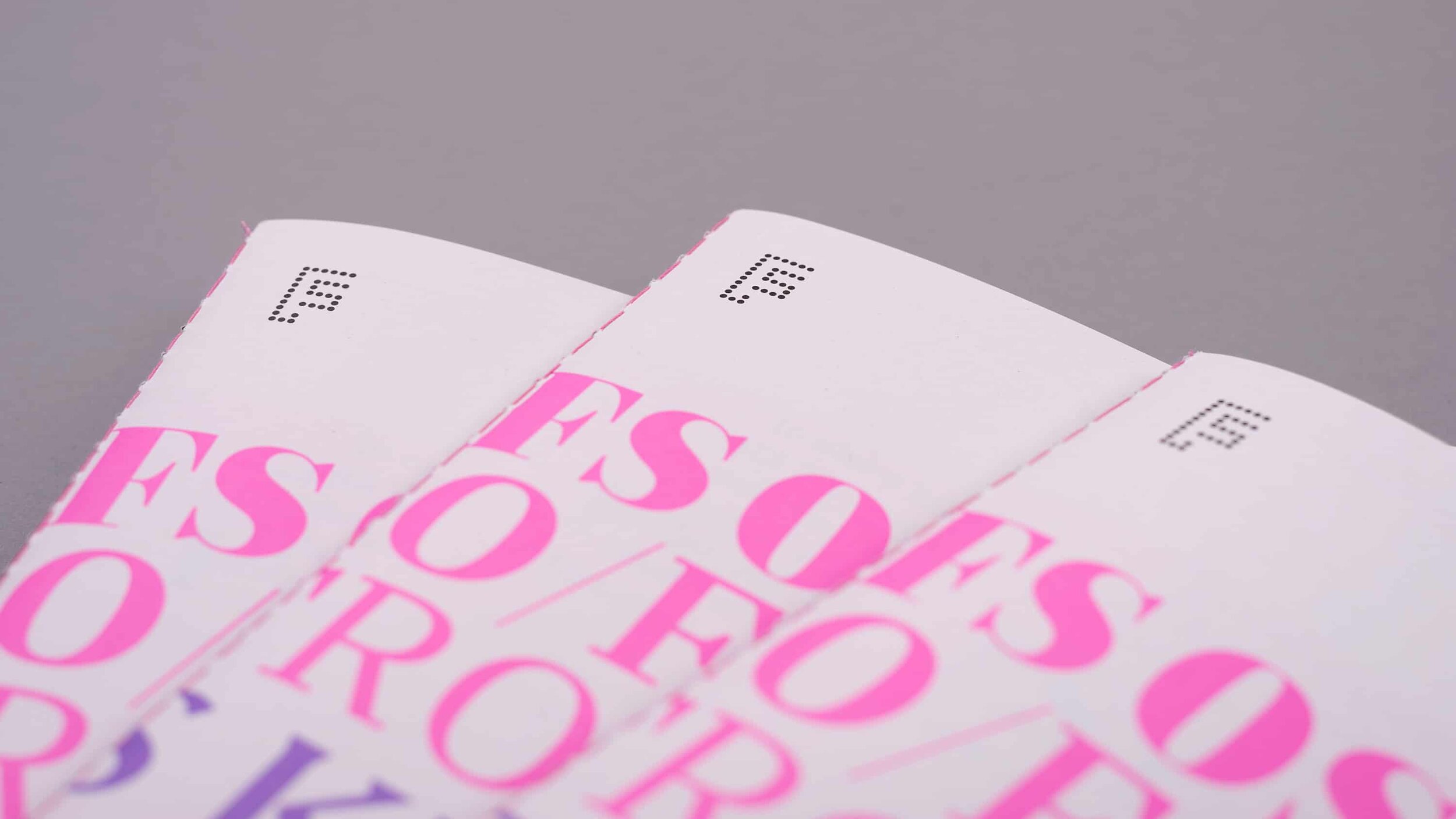
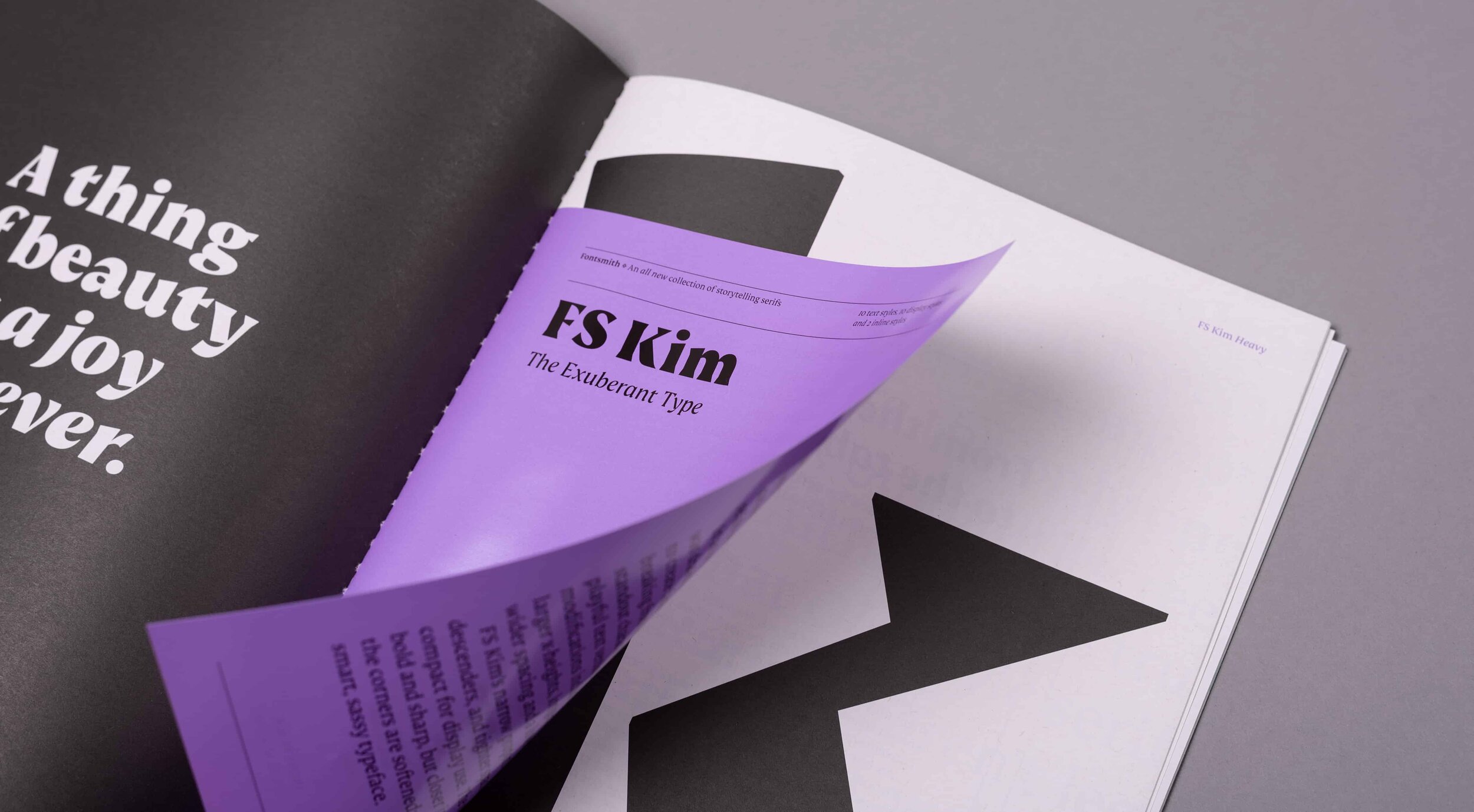
STORYTELLING SERIFS
The launch of a new trio of serifs—FS Neruda (by Pedro Arilla), FS Kim (by Krista Radeova) and FS Ostro (by Alessia Mazzarella)—was a month long campaign, which culminated in a printed type specimen.
Although the trio are distinctly different from each other, the one thing they all have in common is that they are perfect for storytelling. So we designed the campaign focused around those who tell stories – from books to newspapers and magazines, to online editorial platforms and brands. The format of the newspaper supplement-style type specimen echoed this.
Not only was it a great project to be involved in, but it won a D&AD award too.
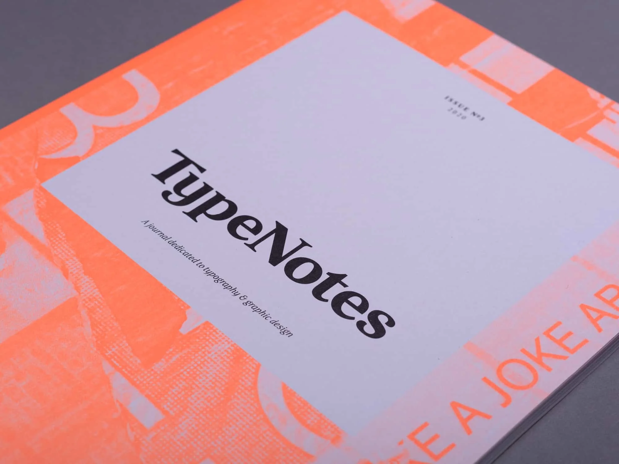
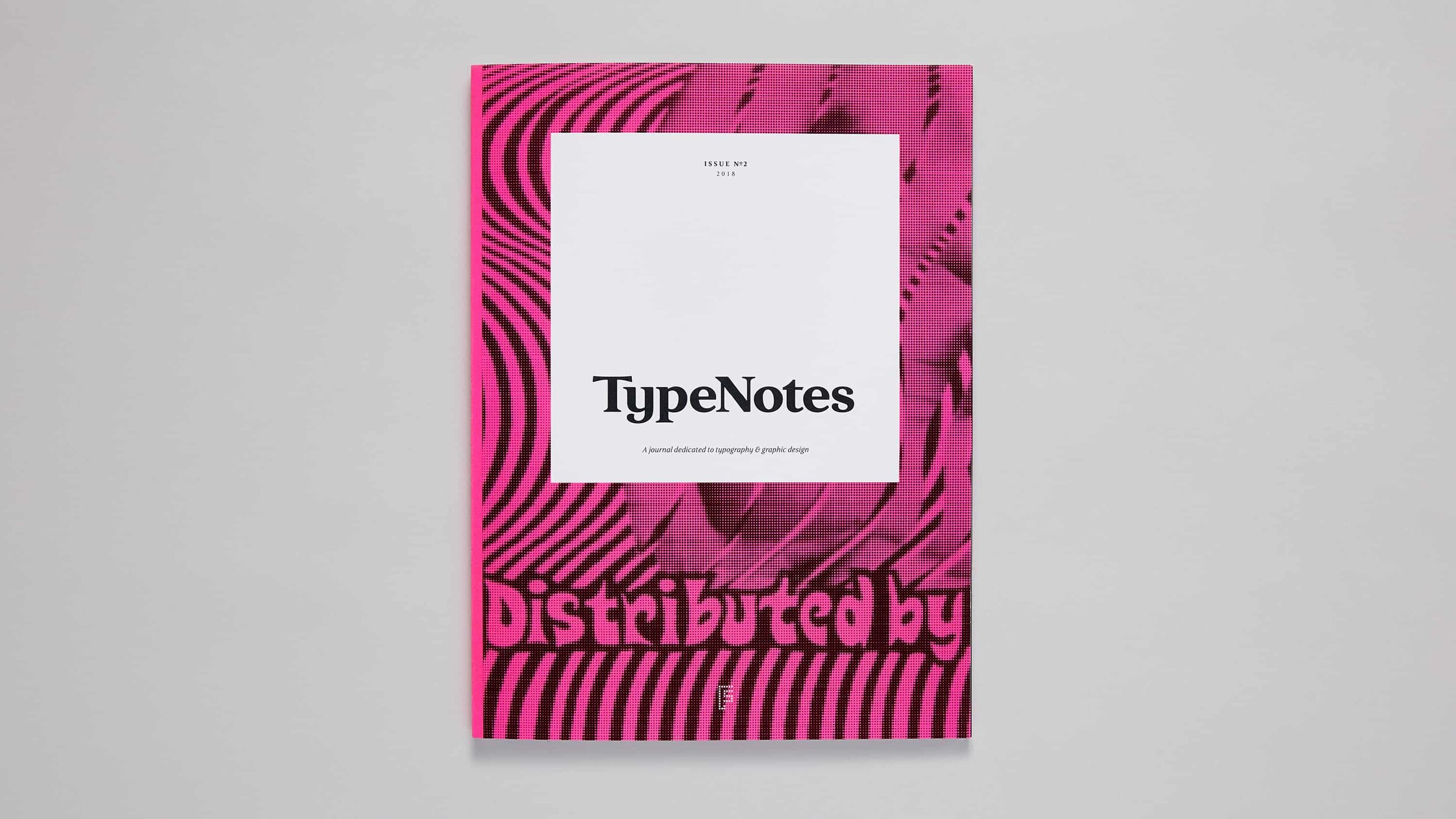
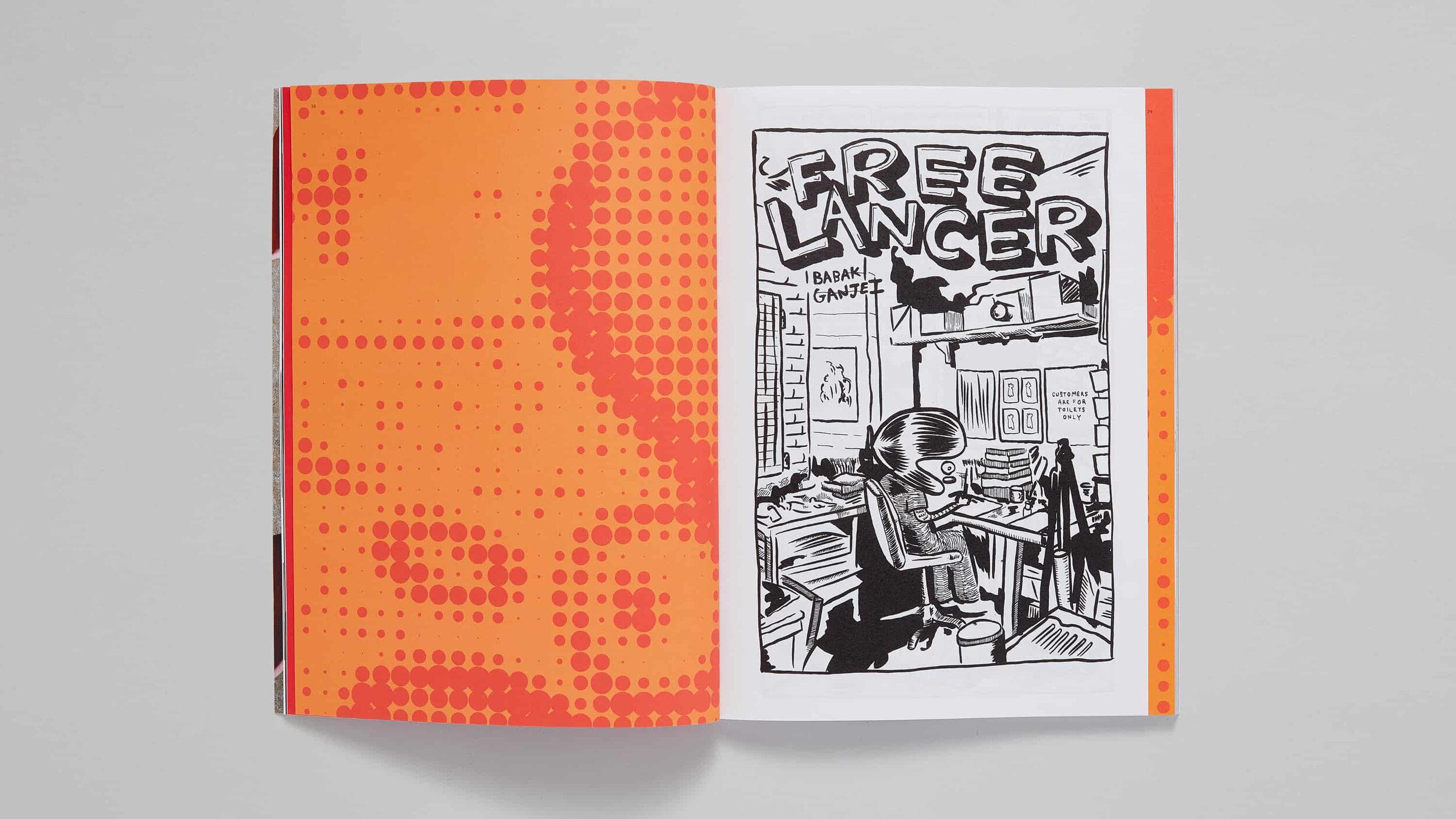
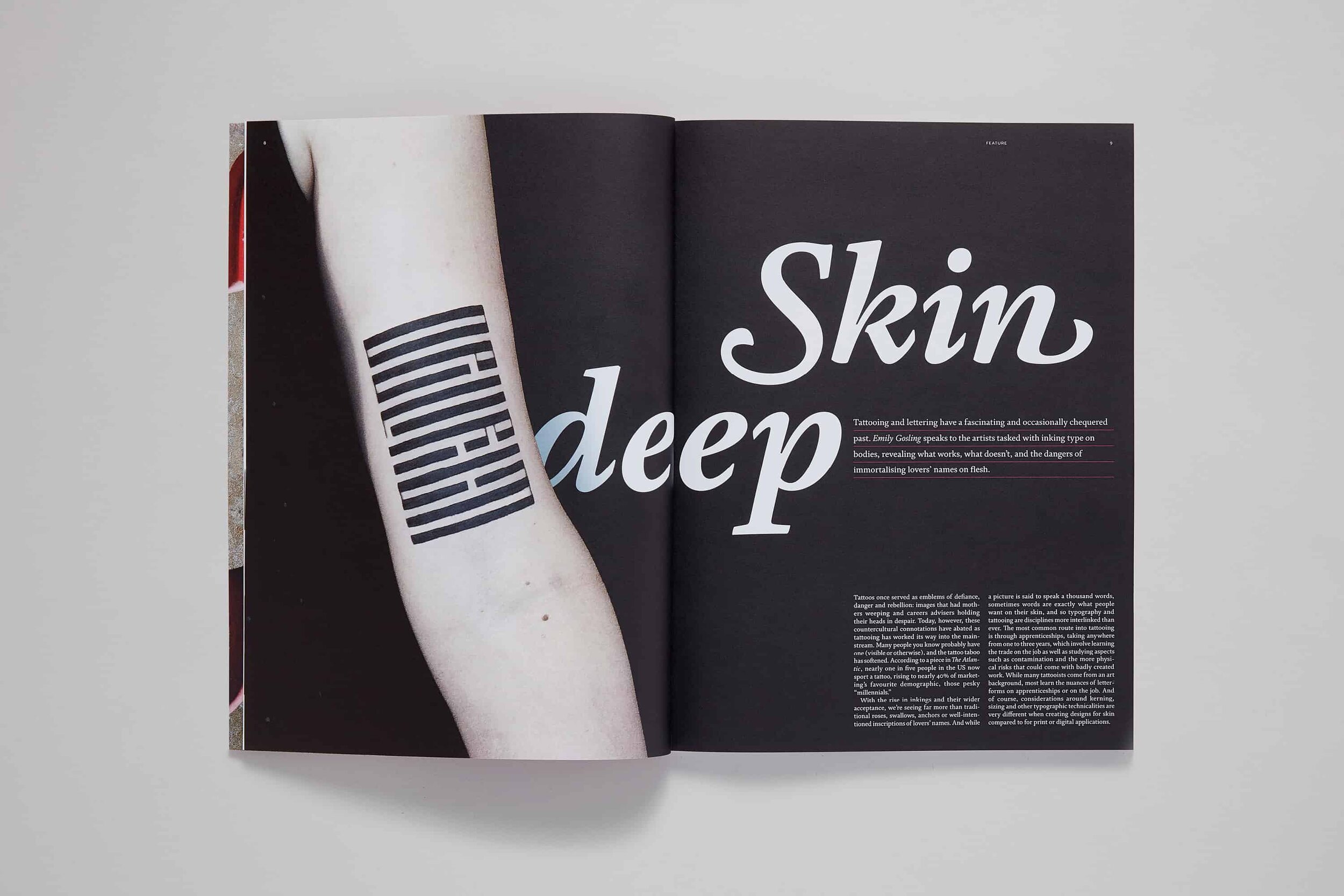
TYPENOTES
Last but not least is TypeNotes magazine, published by Fontsmith and edited by Emily Gosling, was a joy to work on. The diversity of content and the rich library of type at our disposal, meant that the three issues were a typographic treat to design as well as read.