
MAKING THE BRITISH HAT GUILD IDENTITY

Recently, we created the identity for the newly reformed British Hat Guild, and it quickly became our most “liked” piece of work to date.
A few tweets and instagram posts in and we were starting to get some genuinely lovely comments. Everything from “so simple!” to “genius!” – with a few “on fire” emojis thrown in for good measure. Not that social media likes are the be-all and end-all (although it is nice to get nice feedback), but the comments got us thinking…
Now, if this all is sounding a bit self congratulatory, bear with us, it’s not. Because, no matter how good all of this was for the ol’ fragile creative ego, the truth is that it really wasn't either genius or that simple.
It made us think: as creatives we don’t often share much of the painful process work, the terrible ideas, the doodles and designs that, on reflection, can make you wonder what you’ve been doing with your life for the last 16 years and how you’ve managed to hold down a job. Instead we all mostly put out a very carefully curated version of ourselves for the world to see—only the best bits, the bits we want people to know we've done, the bits that make us look our best. Even the “rejected routes” and “things that never made it” posts tend to only be the things we think are too good not to show. It’s never “here’s the route we're really glad they didn’t pick”. And we're no different.
So, we thought we’d open our sketchbooks and do a bit of a warts ’n all look at this particularly project: the good, the bad, and the what were we thinking? It’s a project we’re very proud of, but it wasn’t easy to get to. So this won’t be pretty but it might just be interesting.
The brief…
To begin with the brief was pretty straight-forward but quite prescriptive: the country’s leading milliners and hat makers were coming together to form a new guild, with the core aim of protecting and promoting their craft. For the identity they wanted a new crest as its symbol (and we mean crest in the most traditional sense). The feeling being that a crest was firstly “what guilds have” and secondly, would add gravitas and stature to this fledgling organisation.
Starting at the start…
Our initial reaction was that this was a great project but that a crest might not necessarily be the right, or only, answer. Our concern was that pulling off an authentic looking crest (that didn’t just look like a cheap pastiche or bad local football club badge) would be incredibly difficult, but mostly we were concerned that trying to give faux heritage to what was in essence a brand new organisation with very future-focussed objectives, would be both disingenuous to itself and not the right approach for the younger audience it would need to speak to. The first challenge was convincing the client that their crested conviction wasn’t perhaps right.
As always we started with some analysis, which quickly dispelled the first assumption: that guilds have crests. The traditional livery companies of London, most counties, and some football teams definitely have crests; but across the board guilds don’t. In fact we almost couldn't find a guild with a crest.
The second assumption—that a crest would add instant stature—is hard to prove or disprove, and despite our reasoning, opinion was still in favour of this approach. So it was agreed that we would look at this as our primary option, along with our recommendation that we also explore a more contemporary and iconic route.
Starting any project is always tough, making those first marks and trying to put ideas into shapes is always difficult – but looking back on those early sketches you realise just how difficult it is!
Crests are hard…
Perhaps this was our lack of crest-drawing ability, in fact it almost certainly was, but without the budget to commission an illustrator we were on our own in a world of shields, scrolls and hat-based paraphernalia. And it was hard.
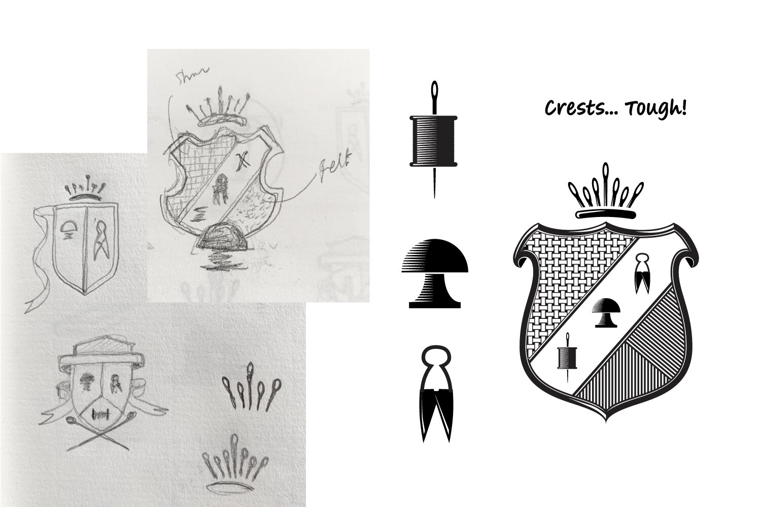
Above are some sketches and development work, which aren't too bad, but aren’t great either.
Despite our best efforts we just felt that none of this was working—perhaps because we knew that even if we had had benefit of a good illustrator onboard, crests are still complex and difficult to reproduce at different sizes, they need decoding, and ultimately inventing one from scratch meant there was no actual heritage to draw on—we were making stuff up and above all it lacked authenticity.
Struggling with the very traditional crest, we then started to explore deconstructing and simplifying: breaking down what makes a crest, reducing it to its component parts to see if there was a more graphic approach. We came to the conclusion that at its heart a crest could be boiled down to a shield-like shape and some form of scroll or band.
We started working with two simple hats, one flipped upside down, which could be used to form a shield with a natural band dividing it. This “crest of hats” was starting to feel like it could work and became the second route.

It was a decent route: it answered the brief as well as the original request for a crest, and we’d have been happy to run with it—but again something didn’t feel quite right to us, it was maybe still trying to be something it wasn't?
Pushing for something new
We knew there was something else we could do… Something simpler, more iconic and more fitting of a modern brand. It was just one of those jobs that felt like there might be a nice little idea hiding in there somewhere… All we had to do was find it.

Sketching gets everything out: the good, the bad, and the “what were you thinking?!”
Like everyone, we went through lots of ideas… Some good, some bad, and some you couldn’t even call ideas. The trick here was not giving up… We ended up spending more time on it than we had originally allowed, but that was a very conscious decision on our part to get the project to where we felt it needed to be.
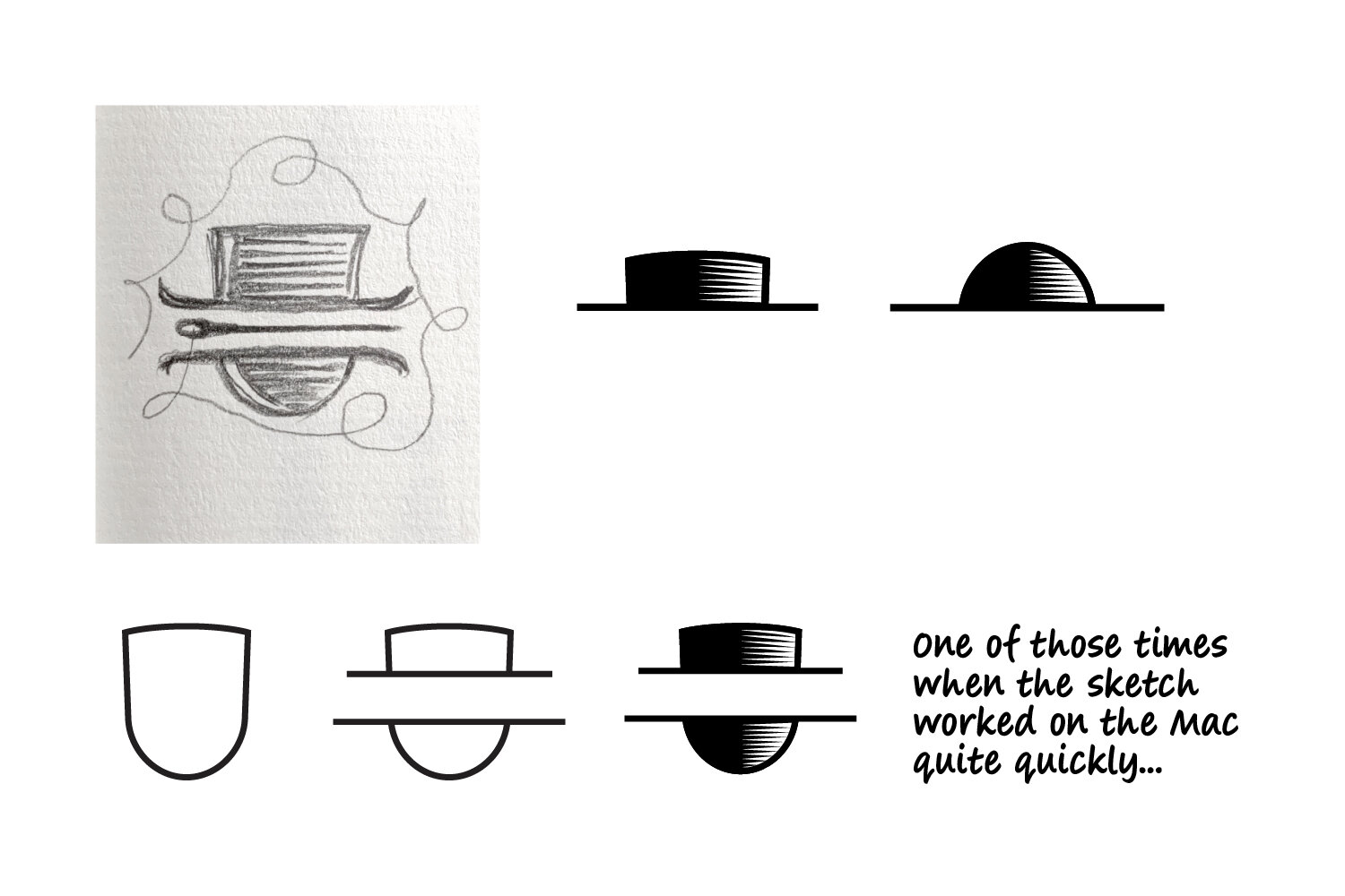
As is often the case, one little doodle started to look promising, the beginnings of a thread… “what if… what if we could get a head and a hat in the negative space of the capital H…” And so it began…

For the second time, this is where not giving up too early comes in: what looks good as a doodle on paper doesn’t always, at first, look so good in the harsh glare of a retina display and pixel-perfect béziers.


We literally drew hundreds… Every little bit seemed to need endless tweaking to get it right. The H itself was drawn from scratch to make sure the internal shapes were head and hat like enough; the serifs top and bottom deliberately don’t match so that the “neck” appears wider and the top of the hat is more complete; the crossbar was curved to create a sense of form and to work as both the hatband above and the shadow beneath the brim. Then the brim was drawn and redrawn to get the right tilt, angle, curve and width; the little barb was added on the left hand side to imply the brim going behind the head… And of course it had to be as gender neutral as we could make it, as the guild covers hats for everyone and anyone.

Typographically, we needed something to balance the bold, chunky symbol; we were looking for a little nod to the past—to reference the long heritage of millinery—but with a more modern feel. A bespoke calligraphic “The” was combined with FS Cattle by Fontsmith—a typeface based on vernacular painted lettering found in London's Soho—to give a suitably British feel.

Looking back there were more than a few times when it almost got binned—and plenty of versions that did, but we’re glad we stuck with it. Above is the final mark, but this was definitely more a case of persistence than genius.