

THE BRITISH HAT GUILD
A new icon to head an iconic industry.
Originally founded in the 1950s, The British Hat Guild could never have been considered ‘one of the old guilds’, despite the time-honoured craft it represented. But by the time the guild disbanded in 2003, it left this historic trade with no formal association or collective focal point.
In 2019, The British Hat Guild was relaunched by a group of the country’s foremost milliners, makers and hat experts, chaired by the world-renowned Stephen Jones OBE. Born out of a shared vision to preserve and promote the heritage, craft and future of British hat making, the revitalised guild needed a new identity to welcome it back into the world.
A contemporary classic
While hat making has a long established heritage, the guild was an entirely new entity—and one that sits at the heart of the dynamic and ever changing fashion industry—so the new identity needed to reflect this balance.
Originally, the idea of crests and more traditional heraldic approaches had been discussed with the client, but these felt disingenuous and too backwards looking for what is in reality a modern organisation—no matter how old the industry it represents is. With a strategy in place to promote the guild to a newer, younger audience, it was decided that a more timeless approach was required to take the organisation forward.
And so the aim became to create something that would embody and represent the industry, something bold and contemporary, while also being classic enough to acknowledge its traditional past.
Hats at its heart
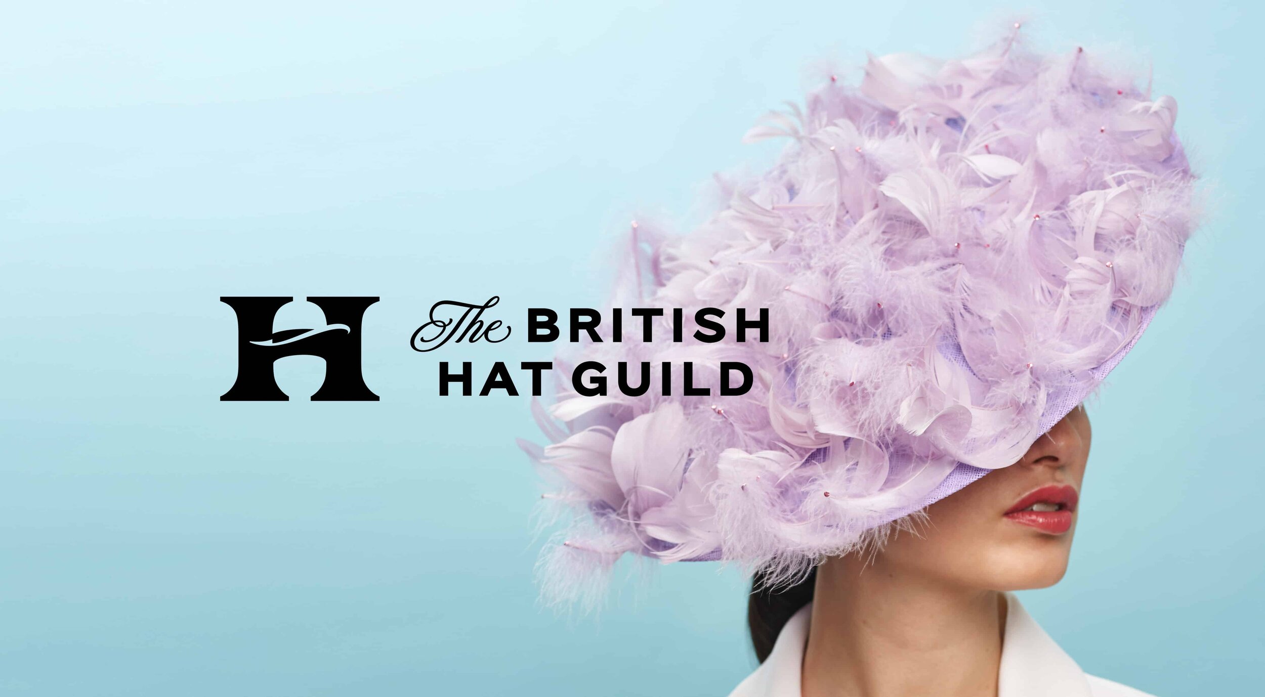
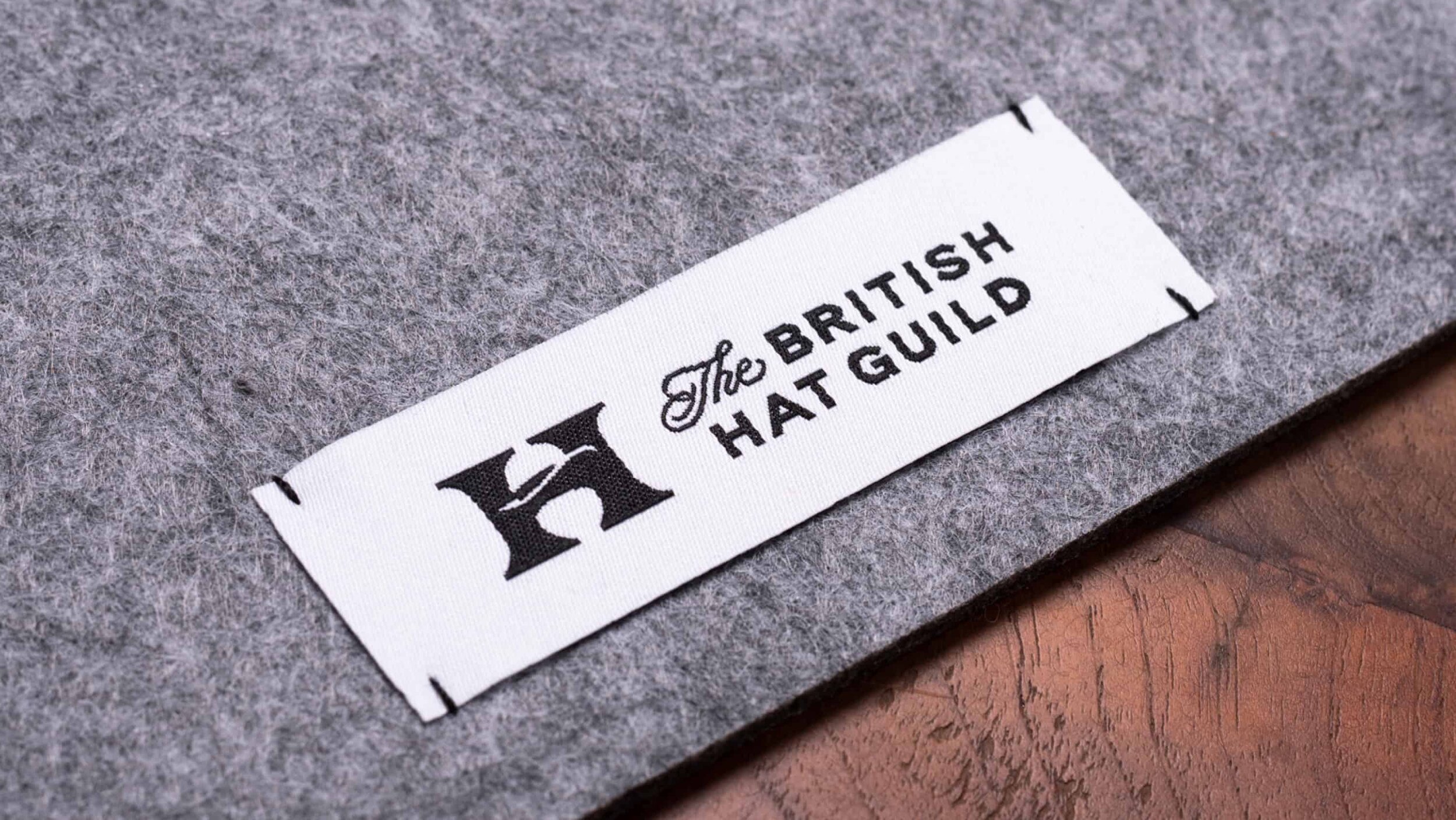
The identity is built around a simple idea: to celebrate and elevate hats and hat making. At its heart the logo features a simple ‘H’ symbol that was specially drawn and carefully crafted to include a little nod to the core idea within its negative space.
—
As with all simple ideas, getting it right wasn’t quite as simple: to get to the final version there were many iterations and tiny tweaks to get the details just right (just like fitting a bespoke hat).

All in the details
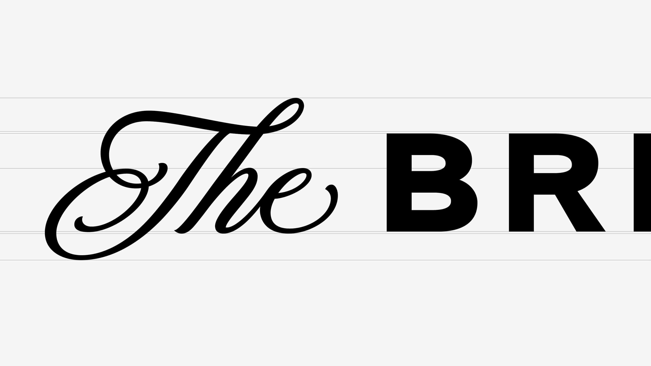
The symbol is paired with a logotype that mixes a more elegant hand-drawn formal script with a distinctly British vernacular sans serif—a combination of letterforms that represents the mix and variety of the guild members’ work.
The design direction is bold yet refined and deliberately restrained, needing to be both elegant and easy to use for the guild members themselves, who are responsible for the management and implementation of the brand.


A bright future
The new brand represents the guild in the most simple, engaging and inclusive way, looking to the future while nodding to the past. A true icon for the industry.
From a standing start, awareness of the guild has increased significantly, and with an impressive founding member list—including Philip Treacy, Noel Stewart, Rachel Trevor-Morgan, Lock & Co Hatters and Awon Golding—The British Hat Guild is now opening it’s doors to new members.

“The guild is so impressed with the work that Counter Studio delivered. The brief was to produce a simple identity that encompassed elements of our craft yet was sensitive to the heritage of millinery. The logo is witty, eye-catching and succinct. They exceeded all our expectations.”
Awon Golding, The British Hat Guild founder member, Head of Millinery Design at Lock & Co Hatters

Photography courtesy of Awon Golding
More projects you might like

Look Like Love
A platform for craft

FS Siena
Introducing a timeless classic
Raw Wine
Refreshing the voice of natural wine