
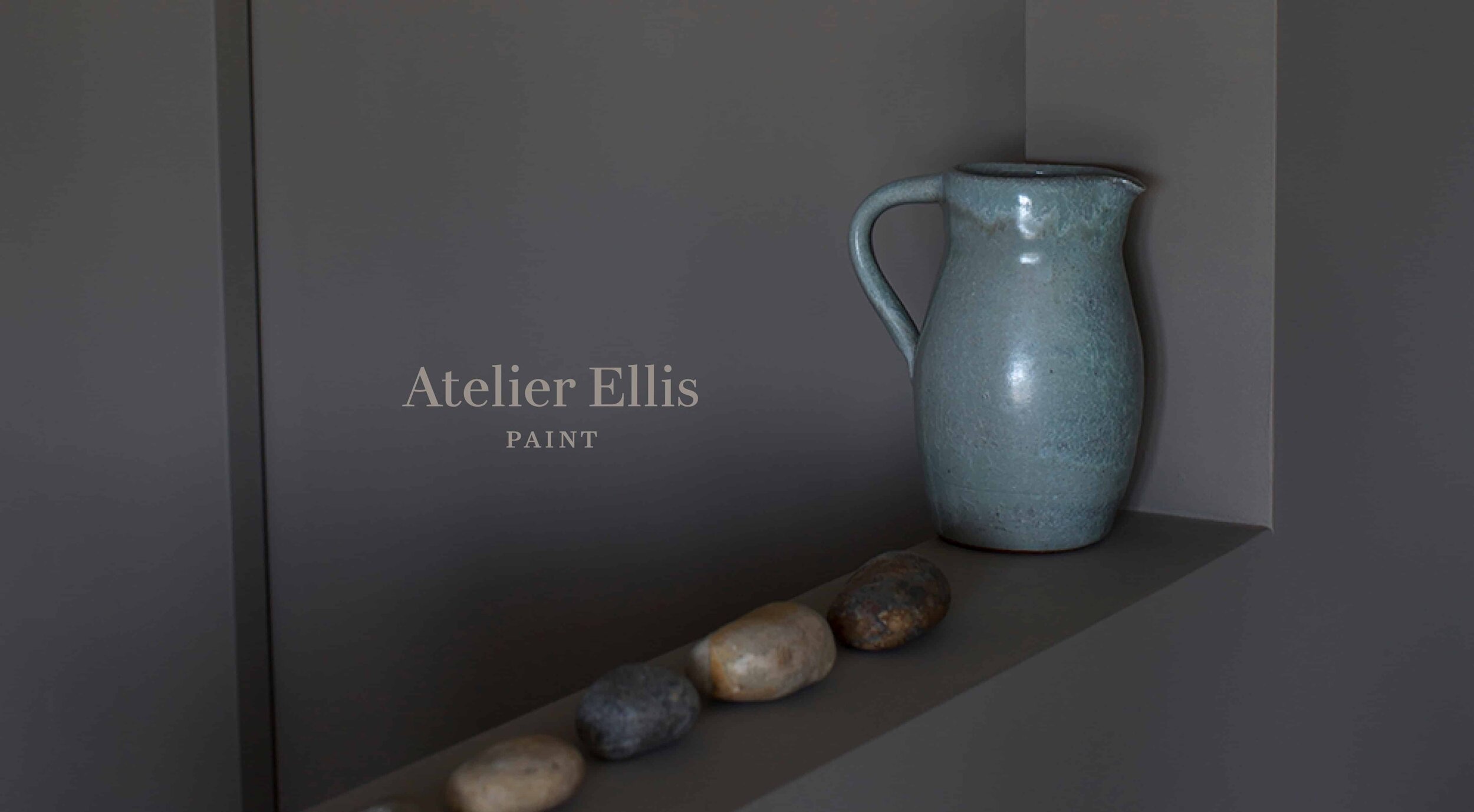
ATELIER ELLIS
Creating quiet beauty
Atelier Ellis is an interior design studio and paint maker, focussed on creating beautifully crafted, hand-mixed paints that are as deeply rooted in the natural world as they are in personal memories, marks and fragments of the past.
Founded in 2011 by Cassandra Ellis, Atelier Ellis has steadily been gaining a reputation for beautiful, quiet colours made with real care under the name ‘Ellis Paints’. But the growing success of the business had caused a rethink and a change in production and operations.
Services
Brand identity
Bespoke logo
Packaging
—
Collaborators
Copywriting—Ed Prichard
Print—WithPrint
Mixing it up
To develop the company in a more sustainable way, a decision was made to bring the paint mixing in-house, setting up a workshop in Battersea with views stretching out over the park. As well as gaining more control over the meticulous production process, it was the perfect moment to reassess the name, the brand identity and packaging to reflect the changes happening in the business.
A simplified story
The first change we made was to align the Atelier Ellis consultancy and Ellis Paints brands into one simple story – with the paint business dropping under the main Atelier Ellis name. This allowed us all to focus on building a stronger, more unified brand and a simpler customer experience.
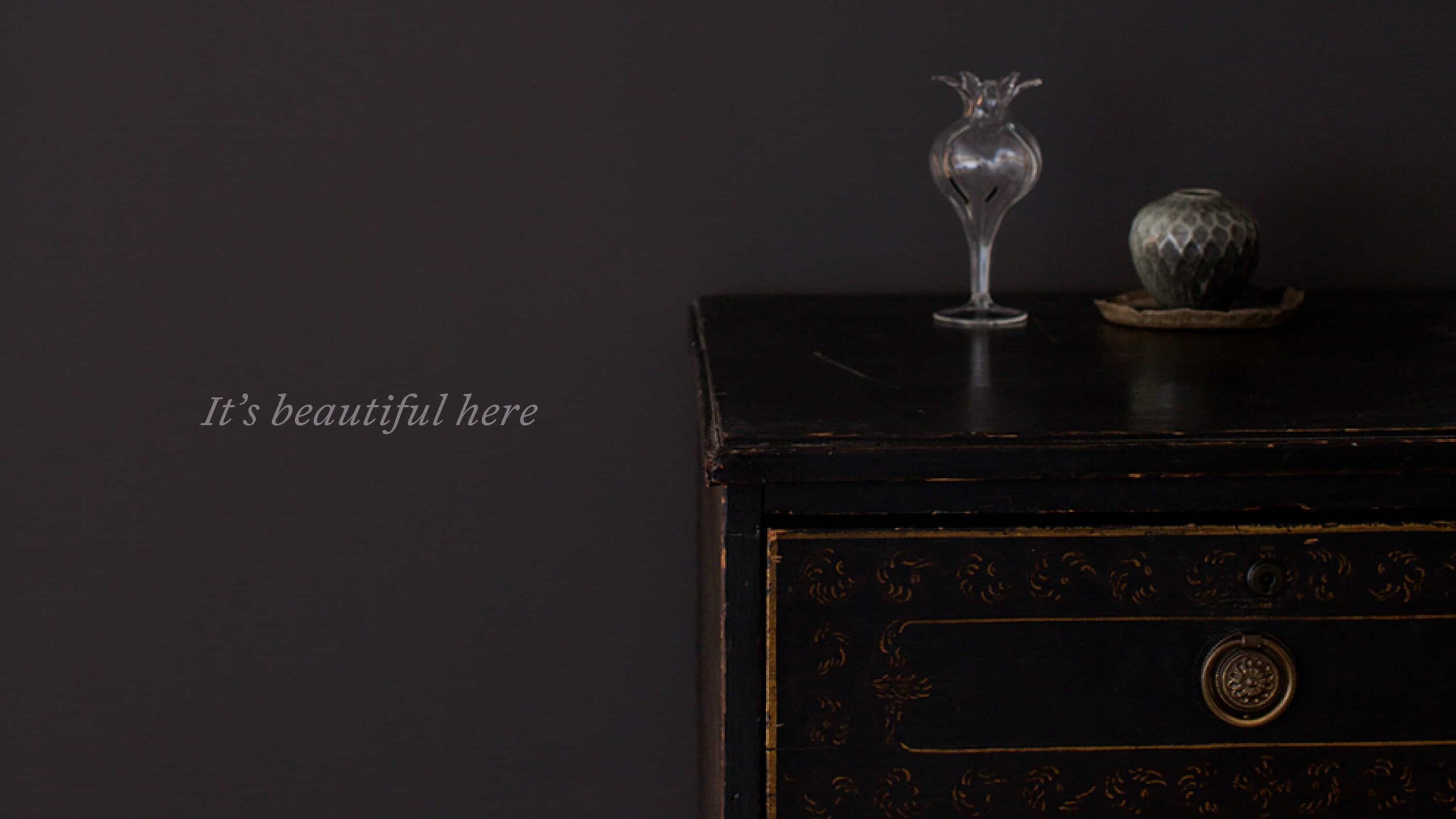
A new chapter
At the heart of everything Atelier Ellis does is the idea of people living in joyous, safe and beautiful homes that tell their own story, and creating the perfect backdrop to how they wish to live.
This core thought of ‘telling their own story’ became the starting point for the refreshed look of the brand.
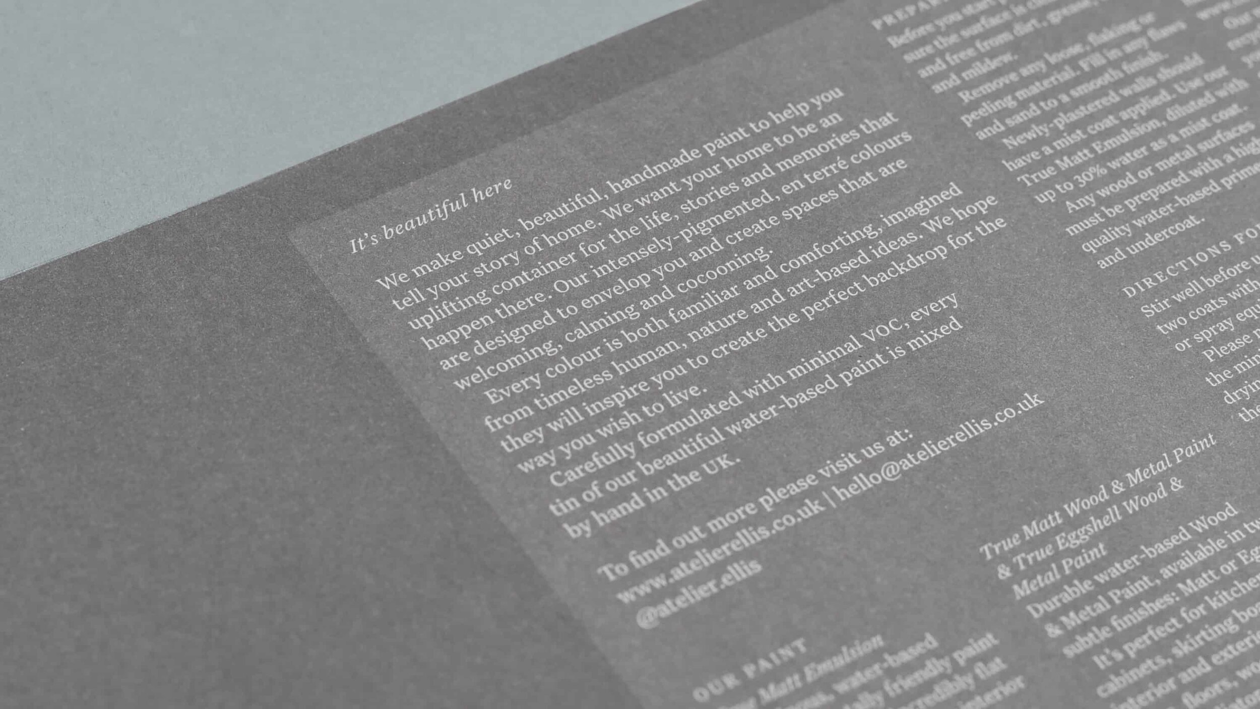
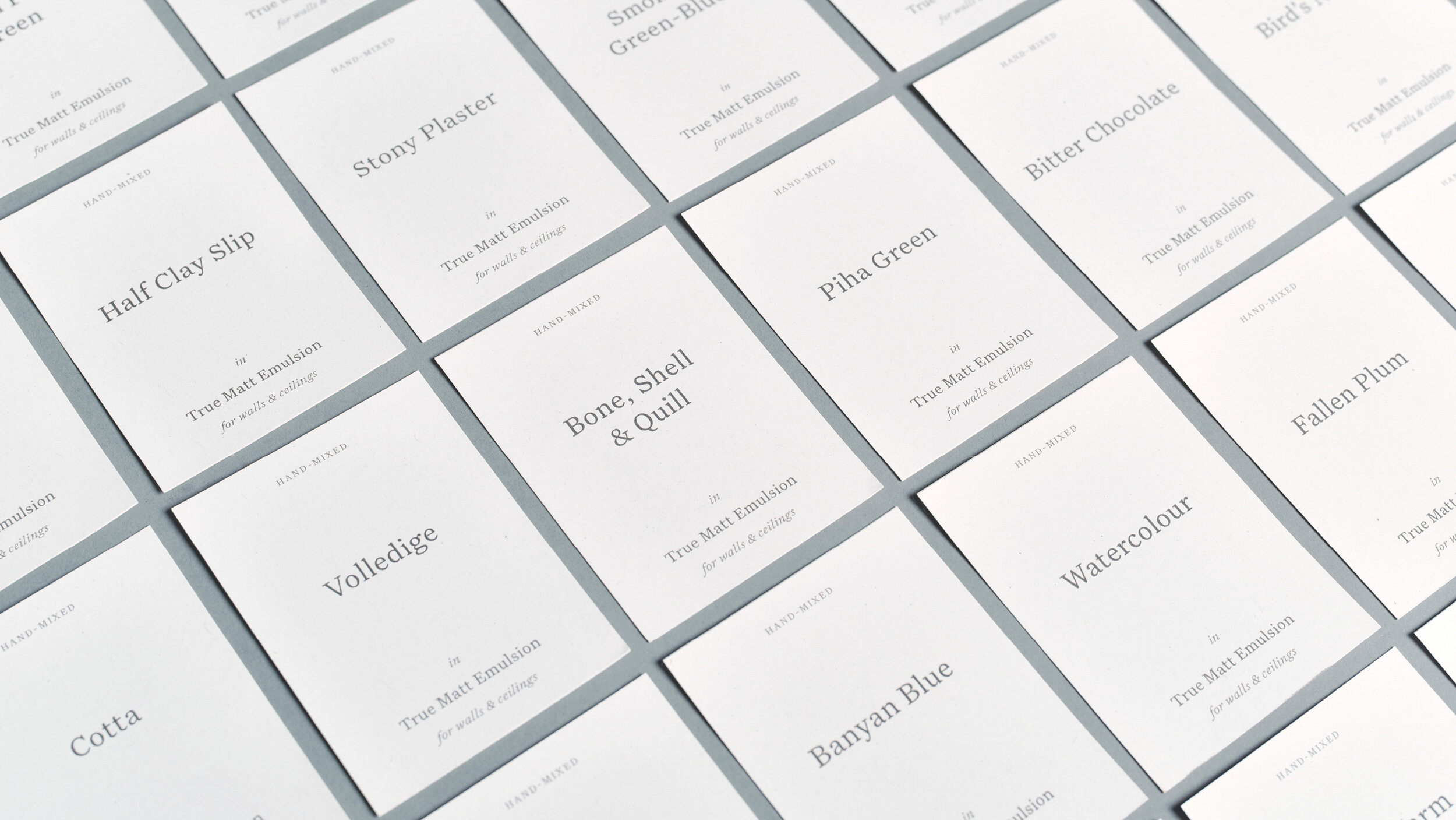
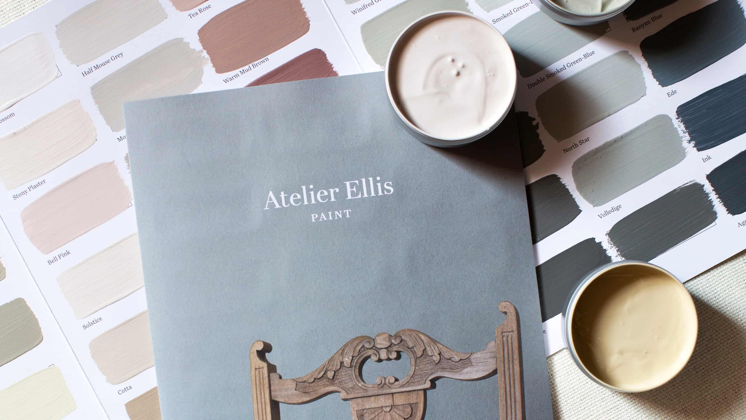
Taking story-telling as our inspiration, we developed a refined and calm design direction that draws on the visual language of books – the design of the labels subtly echoes a title page, while a classic style of typography allows words and space to become the low-key heroes. We introduced a modern interpretation of traditional book typeface, which was used alongside a sophisticated colour palette of Bitter Chocolate, Warm White and Smoked Green-Blue from the Atelier Ellis paint collection.
The whole identity is deliberately understated and quiet, allowing the individual paints and the stories to take centre stage.
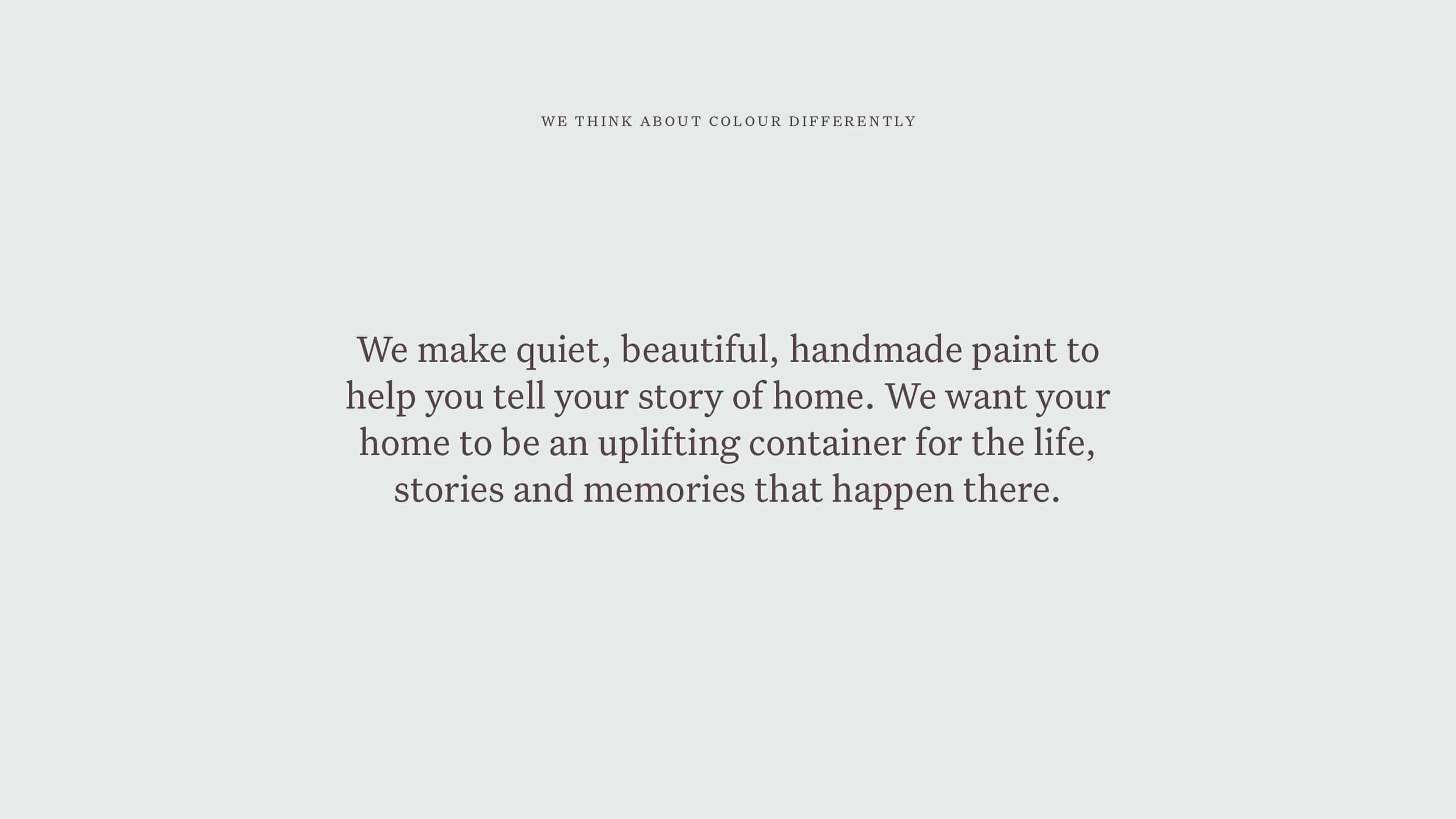
A tale of home
For a brand with stories at its core, language is an incredibly important part of the identity and the writing throughout the brand is pitch perfect. Written by Ed Prichard, it brings a richness and vibrancy while capturing the subtle delicacy and honesty of the colours in words.
The start of something beautiful…
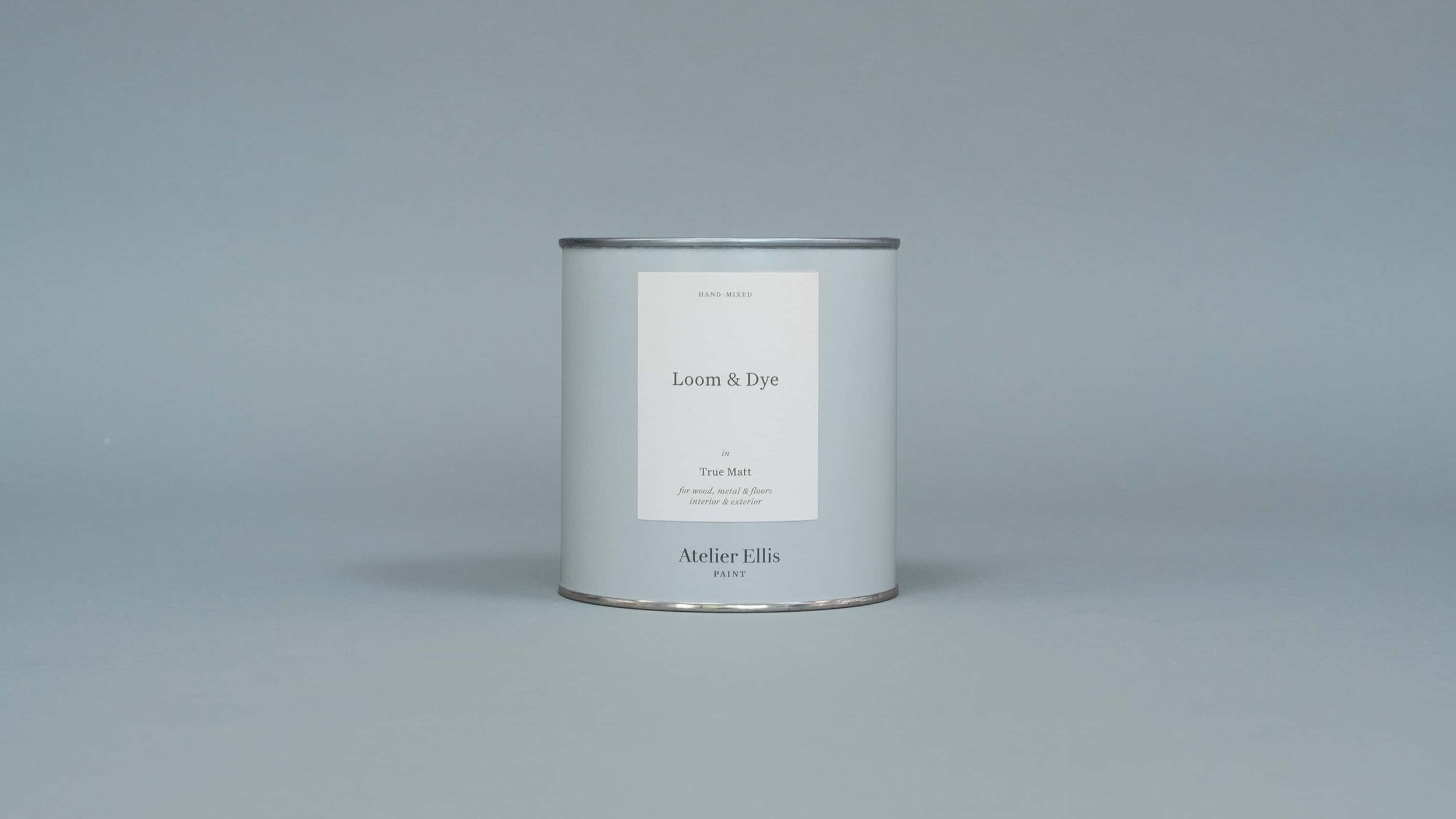
Moving the paint production in house was an opportunity to rethink the design of the tins from the ground up. Being a direct to consumer brand meant that the design didn’t need to shout in order to stand out on busy shelves, which allowed for a far more restrained approach. The new fully recyclable metal tins also needed a cost-effective design solution that would work across three different sizes, three different paint finishes and more than 50 different colours—450 combinations in all, and growing.
The system we created allowed for an elegantly simple tin design that works effortlessly across the various sizes, with a single-size label applied by hand to the front of each tin to distinguish the different paint finishes and colours.

A bespoke logotype
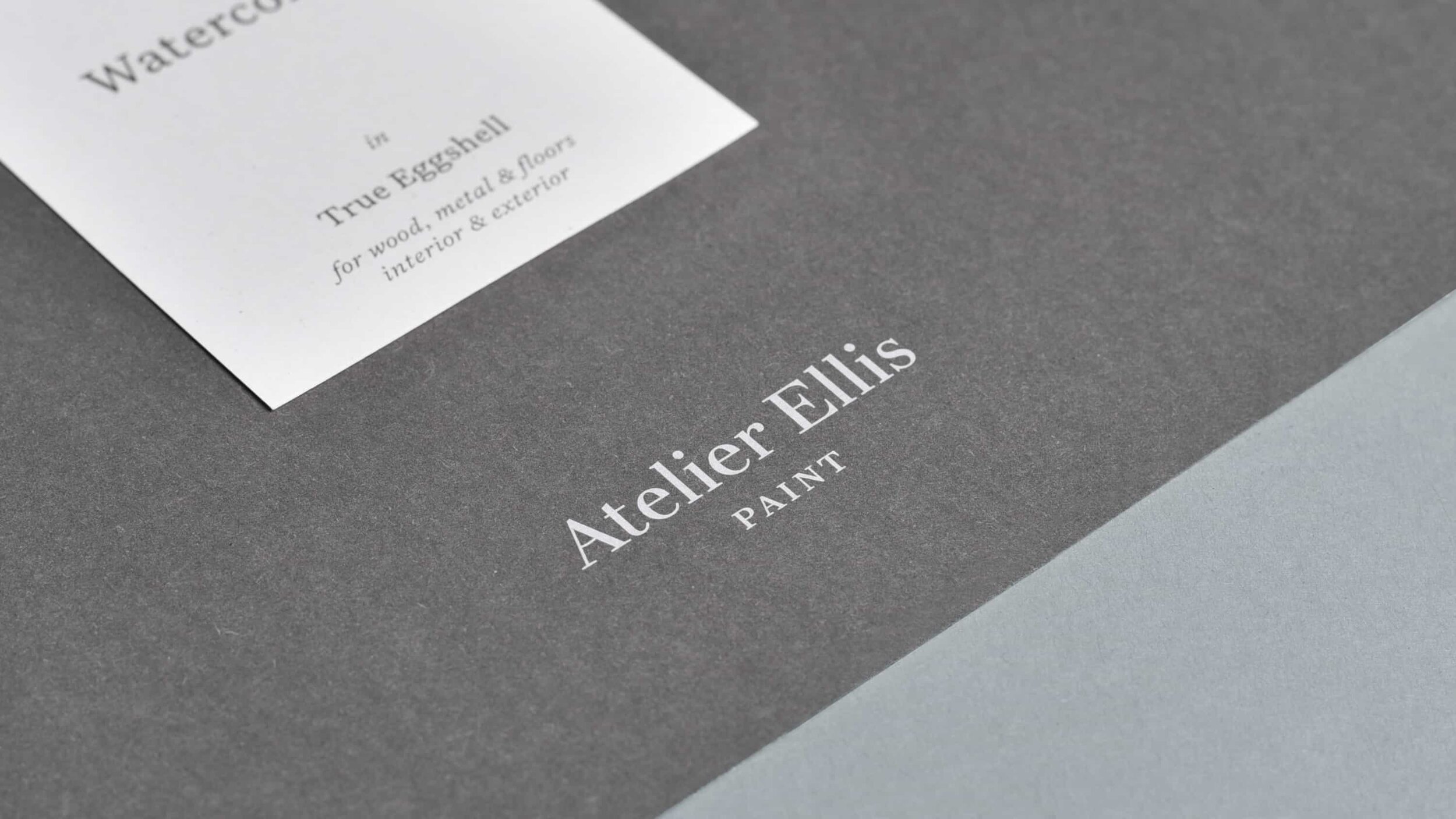
The new name required a new logotype. Previously it had used the typeface Didot, an elegant and high contrast serif—but its delicacy meant it struggled at small sizes and across the various applications from tins to colour charts. We redrew the wordmark from scratch based on the same characteristics, but refined the shapes and added a subtle sense of warmth and joy to the letters, all while making it more robust and legible at any size—a contemporary take on a traditional classic.
The hero of the story
The identity has been designed to allow the colours and the stories around them to shine—sophisticated, refined and beautifully quiet, just like the paint itself.
—
With thanks to Atelier Ellis / Kalina Krawczyk for the still life photography
More projects you might like

Bibendum
Relaunching an icon

FS Brabo
Fact meets fiction in an eloquent typeface launch

The British Hat Guild
An icon for an industry