
BIBENDUM
Relaunching an icon
Once a jewel in London’s glittering restaurant scene, Bibendum had slowly fallen out of favour with all but the faithful few. Struggling to entice a new audience through its wonderfully ornate doors, a change was needed if it was to regain its former glory. And so, in a new venture, the late Sir Terence Conran invited celebrated chef Claude Bosi to reinvent and relaunch one of London’s most iconic restaurants.
With a new chef patron, menu and dining experience, the restaurant needed to reinvent its brand in-line with its new direction. Working with creative consultant Dan Rowe, we were asked to create a new identity that would both signal a new beginning and recapture the original Bibendum magic.
Services
Brand architecture
Visual identity
Print design and production
—
Collaborators
Strategy—Dan Rowe

Contemporary classic
We began with the creative force at the heart of the new offer, Claude Bosi – known for his contemporary take on classic French cooking and bold flavours. The first challenge was to create an identity which embodied this same mix of classic and contemporary with a bold personality.


Building on the building
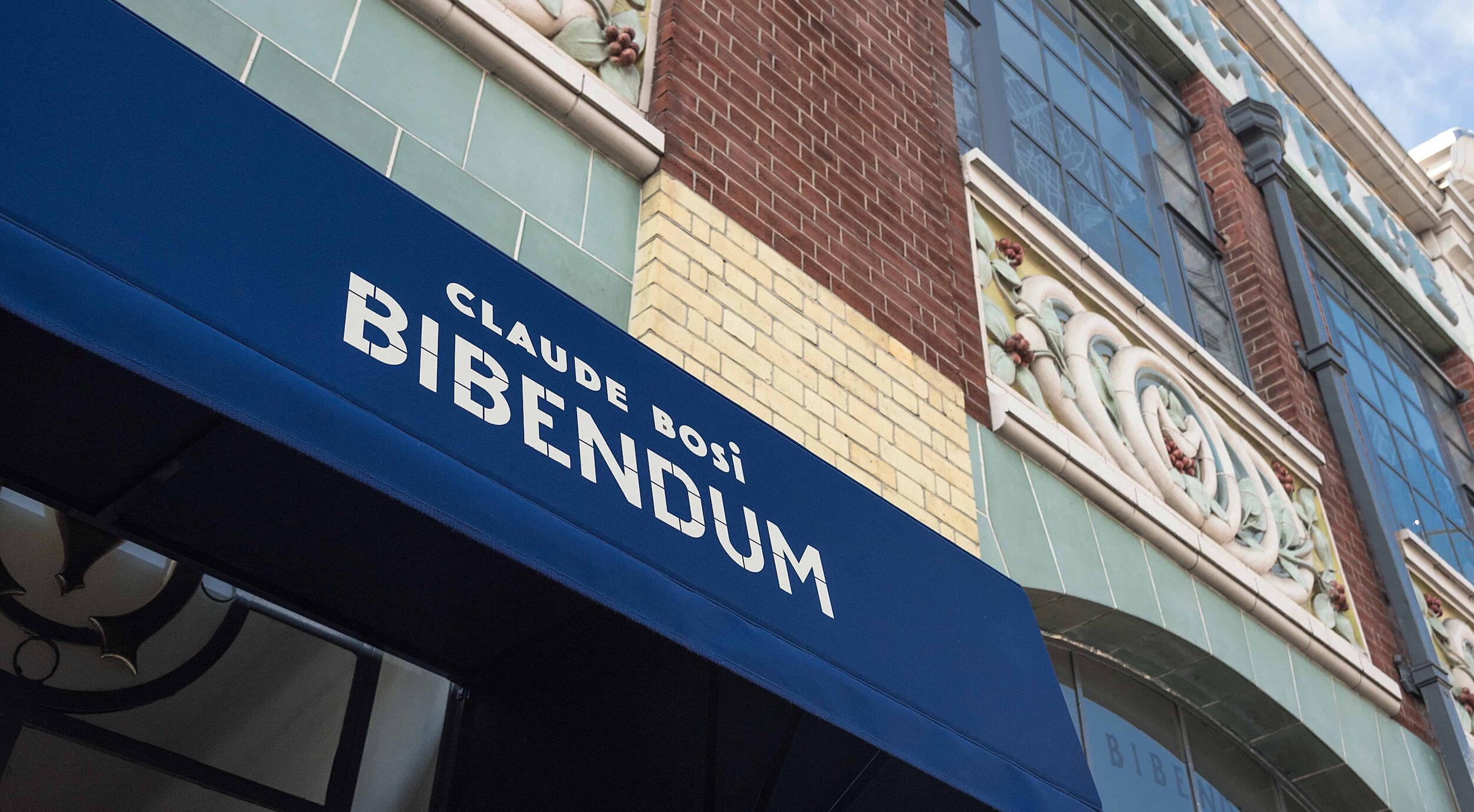
The second challenge was a beautiful one: how to create a new identity for the spectacularly decorative architectural icon that is Michelin House. We knew that the last thing it needed was yet more visual adornment, but we also knew it needed an identity that would be able to cut-through.
The answer was to harmonise with, rather than further embellish, the exquisite existing details. So the new identity was designed to feel like an extension of – and complement to – the building and overall experience.


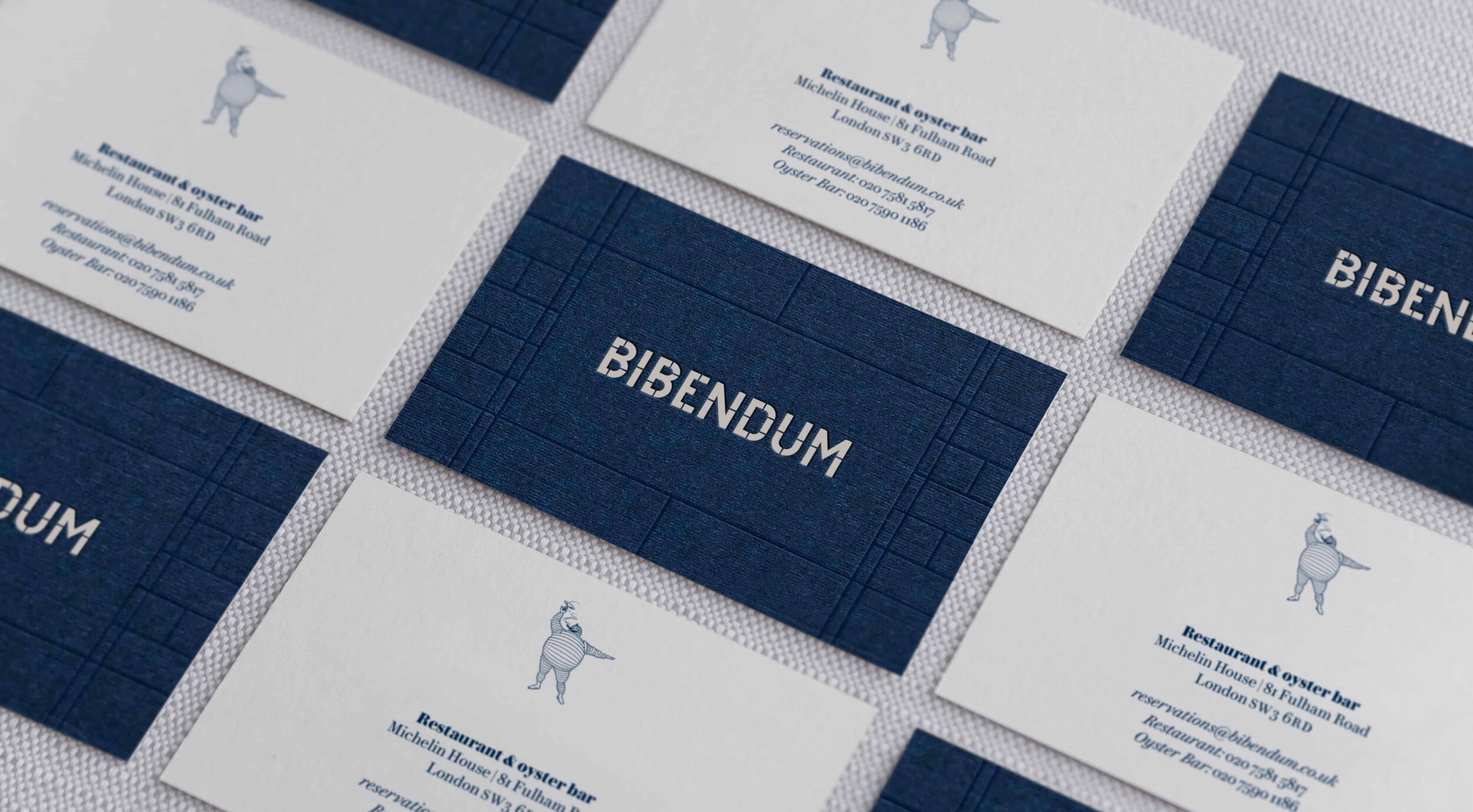
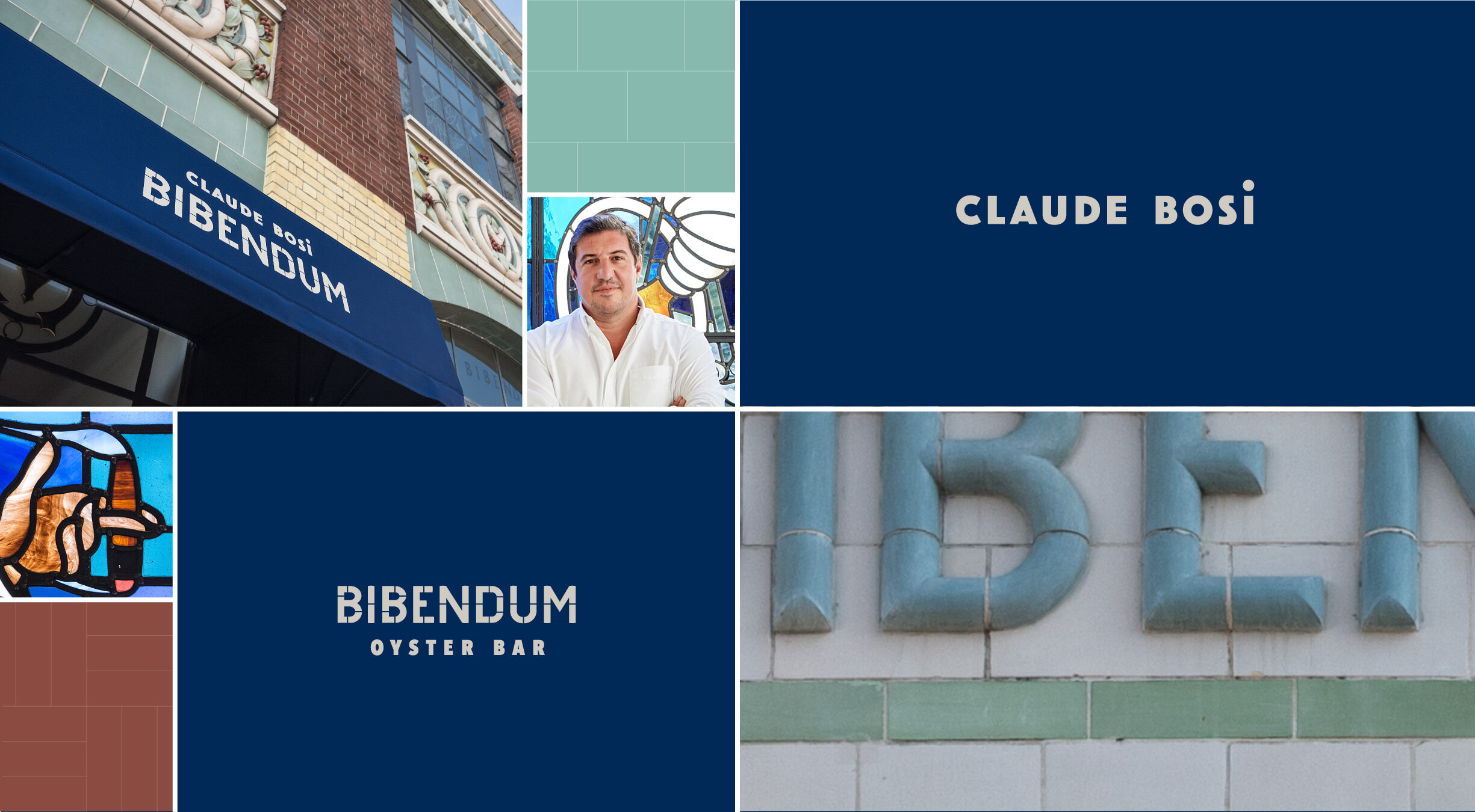
Drawing on the restaurant’s incredible architecture, the identity reinterprets the fabric of the building: a bespoke logotype was drawn based on beautiful tiled lettering that sits at the top of either side of the roof line, while the grid pattern, colour palette and graphic flourishes used throughout were all inspired by the metalwork, brickwork and tiles.
The original ‘Bibendum’ character (AKA the Michelin Man) also remains, a nod to the brand so intrinsically linked with the place, but this time as a more playful supporting element within the identity, rather than the main focus.


One identity, three ways
The identity was developed to work across the two different dinning offers: the more casual Oyster Bar downstairs and the main fine dining restaurant upstairs. This difference was brought to life visually by creating a more embellished French bistro-style look for the Oyster Bar, while upstairs retained an air of more minimal restraint and finer materials – all tied together by the same graphic vernacular inspired by the building.
The third shift was in the personal brand for Bosi. The two identities both stand alone and also combine to become “Claude Bosi at Bibendum”. Claude’s identity is inspired by him and his food; robust yet refined, classic French but with a contemporary twist – resulting in a simple, uncomplicated, but characterful mark.
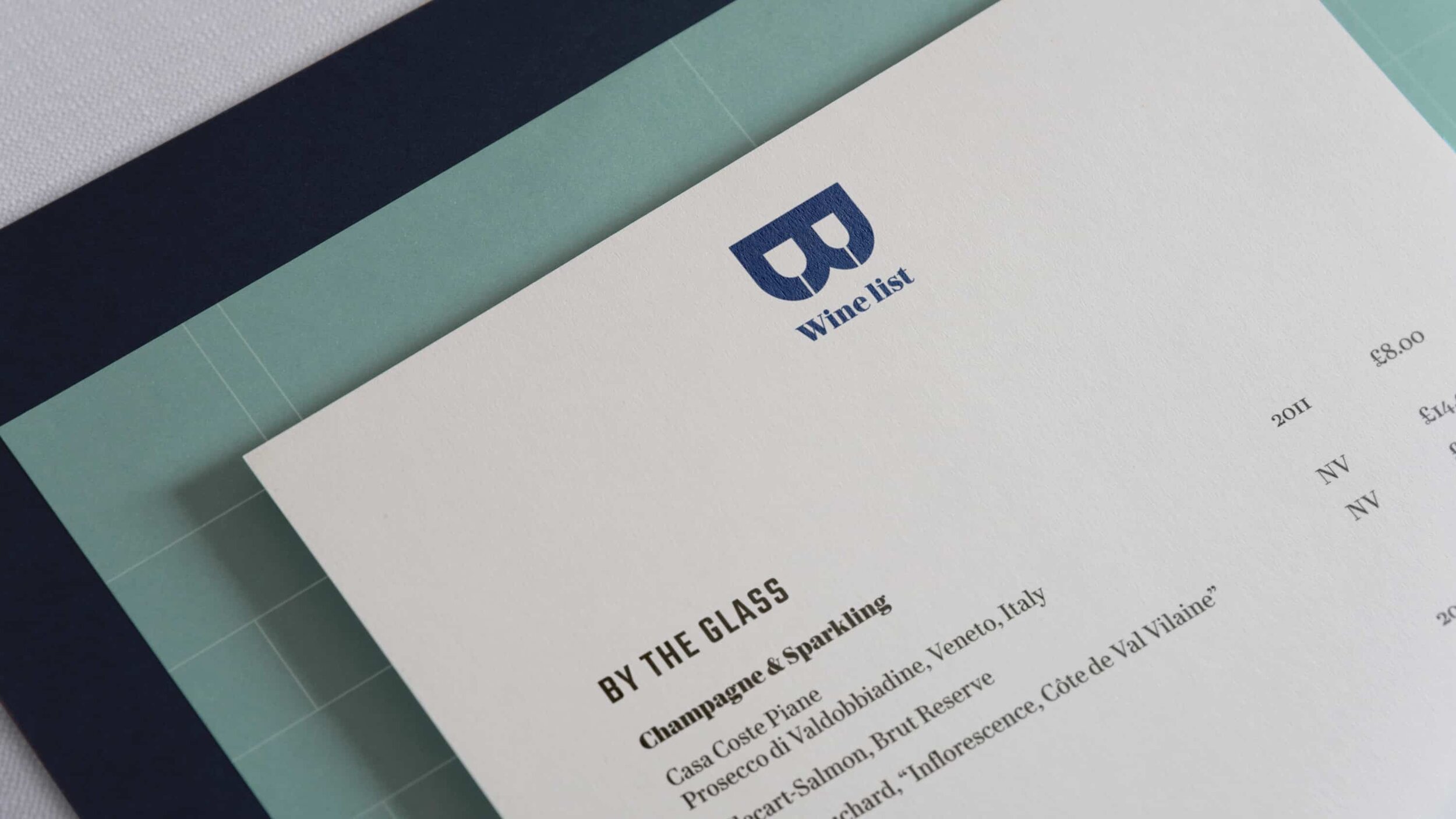
A typographic guide
For the typographic styling, we looked beyond the building to the French Michelin guides and maps from the early 20th century – robust continental sans serifs are contrasted with sophisticated Modern serifs, forming charming catchwords and bistro-influenced titles on menus, order slips and posters.


A star in born (two actually)
Since it’s re-opening, the refreshed Bibendum under Claude Bosi’s leadership has not only received many a glowing review, but has also been awarded two highly coveted Michelin stars – the first time a restaurant in Michelin House has been awarded the accolade.

More projects you might like

Raw Wine
Refreshing the voice of natural wine

Rova
Vavavoom for dogs

Fourteen Drops
Establishing a high street hot spot