

RAW WINE
Refreshing the global voice of natural wine
Founded by France’s first female master of wine, Isabelle Legeron, Raw Wine brings together growers, makers and buyers in a celebration of the best organic, biodynamic and natural wines from around the world.
Originally a single trade fair in London, Raw Wine was expanding rapidly with fairs being introduced around the world. But it had become clear that the identity needed to be revitalised to better reflect the passion and diversity of the community and the wines they make and champion. At the same time, legal restrictions had meant the name needed to change from ‘Raw’ to ‘Raw Wine’, making it the perfect time to reassess the entire brand.
Services
Brand identity
Brand guardianship
Campaign identity
Printed collateral
Website design
Exhibition signage
—
Collaborators
Strategy—Dan Rowe
An opportunity to evolve
With a growing audience and a new name, Raw Wine needed a signal of change and a richer brand experience; one that would go beyond just wine, to one built around its community of growers, producers and enthusiastic natural wine lovers.
As part of this renewed focus, Raw Wine also wanted to take the opportunity to position itself an advocate for authenticity and education; championing the world of organic, biodynamic and natural wine in an industry largely dominated by big producers and industrial mass production.


A refreshing new experience
We worked closely with strategic consultant Dan Rowe, to create a brand that would capture both the quality and the individuality of these wines and their artisan producers, as well as help make Raw Wine the organic, natural and biodynamic wine champion in the industry.
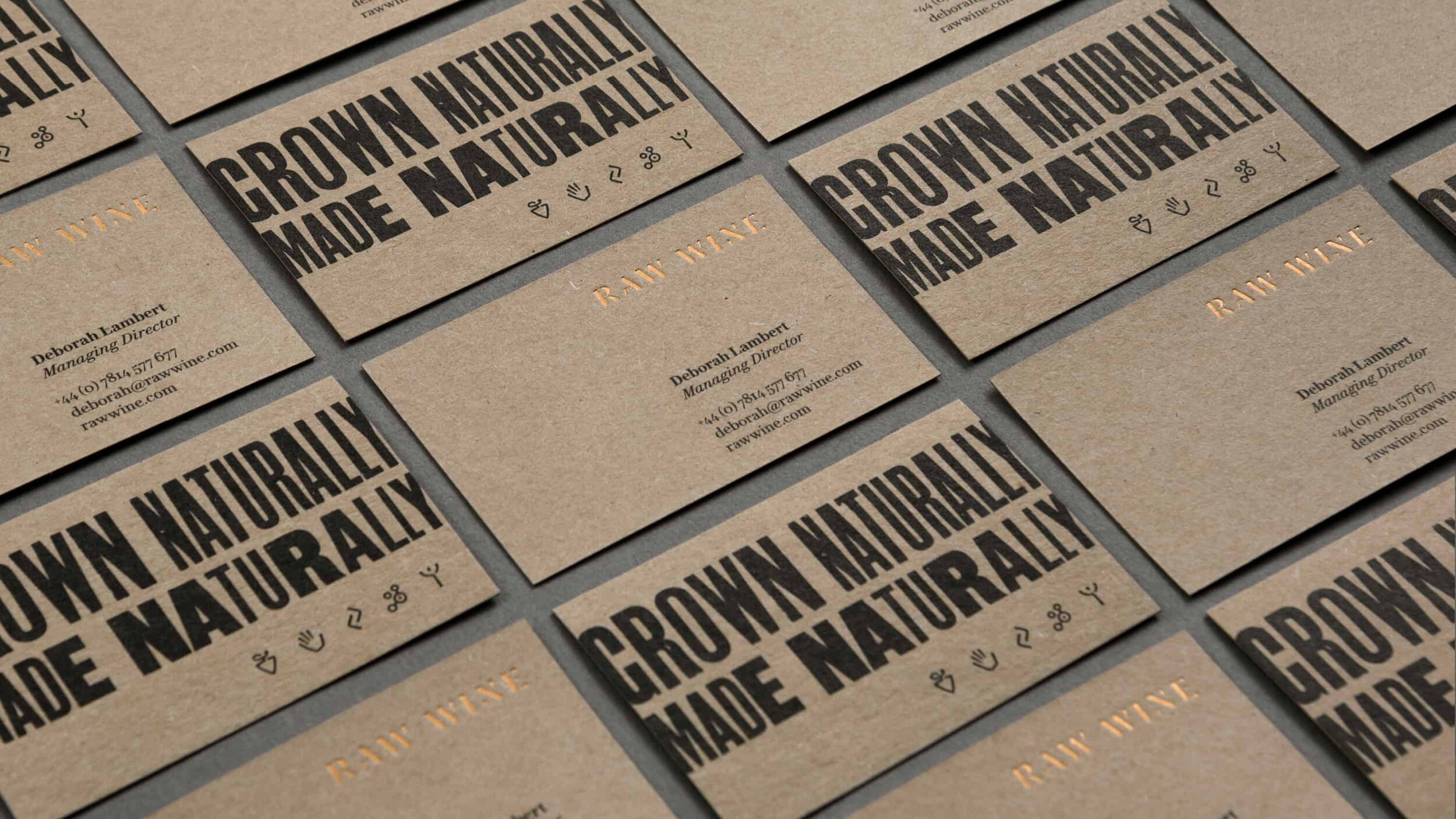
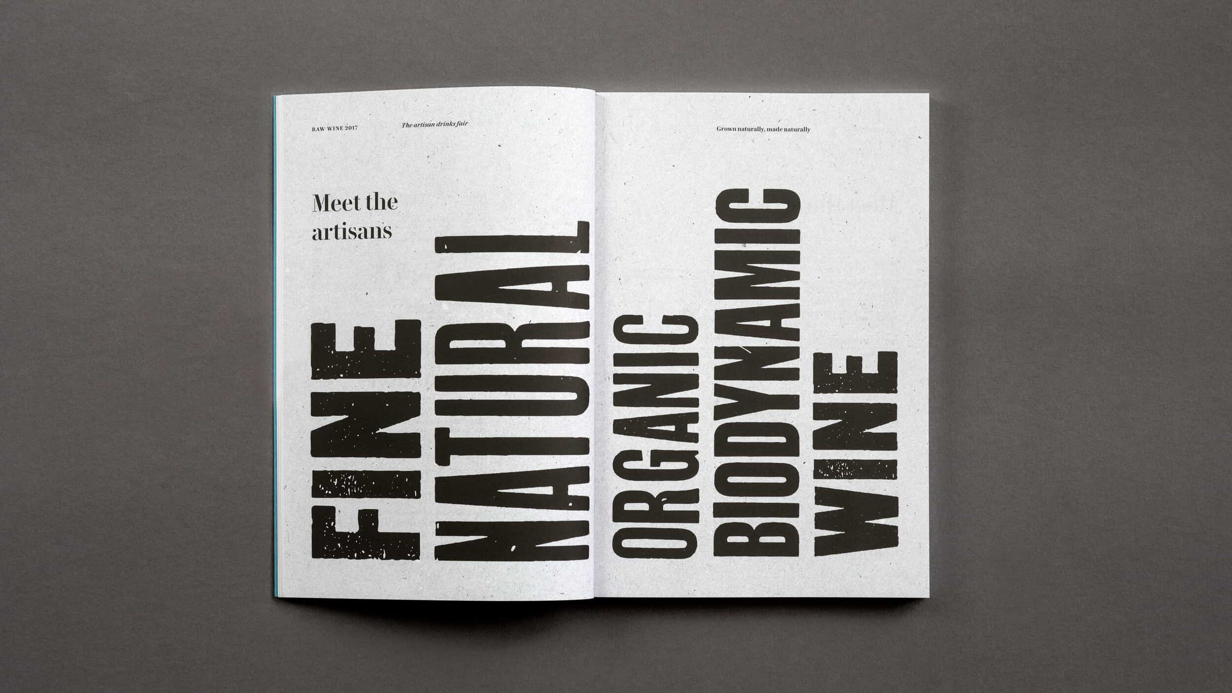
At its heart, the visual identity juxtaposes a natural rawness with a sensitive refinement, reflecting the same balance that characterises the wines themselves. To achieve this we combined the idiosyncratic warmth of traditional hand-crafted letterpress printing and hand inked textures, with the crisp elegance of sharp digital typography, icons and imagery.
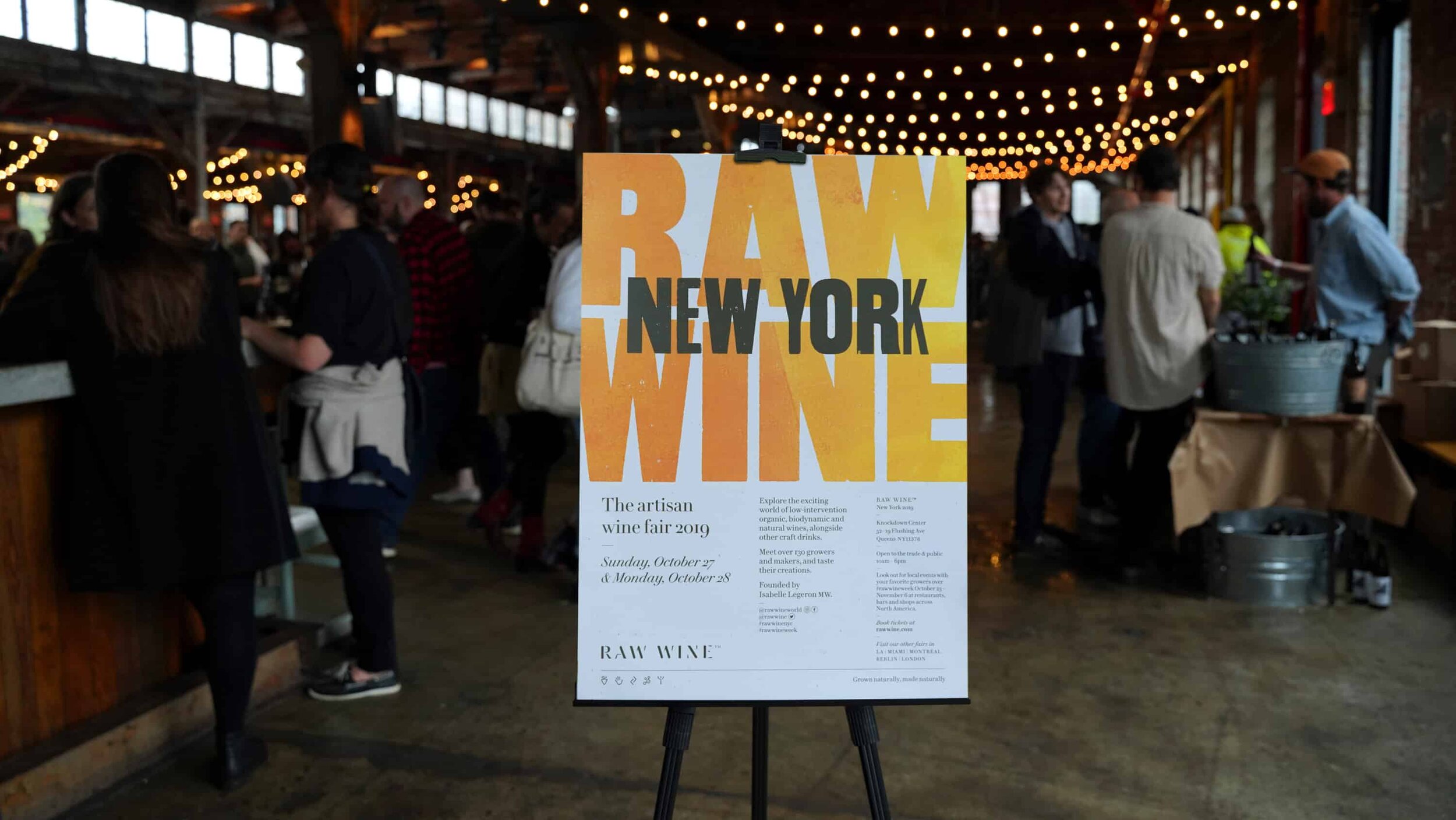
The hero typography was all typeset and printed by hand at The Counter Press, before being digitised to create a unique typographic voice which brings genuine variation across each and every piece.


The new bespoke logotype, inspired by the long established use of stencils in wine making, helps bring a sharp clarity to the brand, acting as a counterpoint to the rustic charm of the letterpress wood type.
A suite of custom icons was also drawn to represent the fundamental founding principles of Raw Wine and act as visual a benchmark for the wines the brand promotes.
From the website to wine glasses, stationery to signage, catalogues to campaigns, not forgetting those tote bags… we helped bring the new identity life and build a brand that can help Raw Wine be a true industry leader.
“Counter Studio are a creative, caring and sensitive team who listen to what our needs are and always come up with designs we love. They are a dream to work with: they understand our brand language and always deliver.”
Isabelle Legeron, Founder, RAW WINE


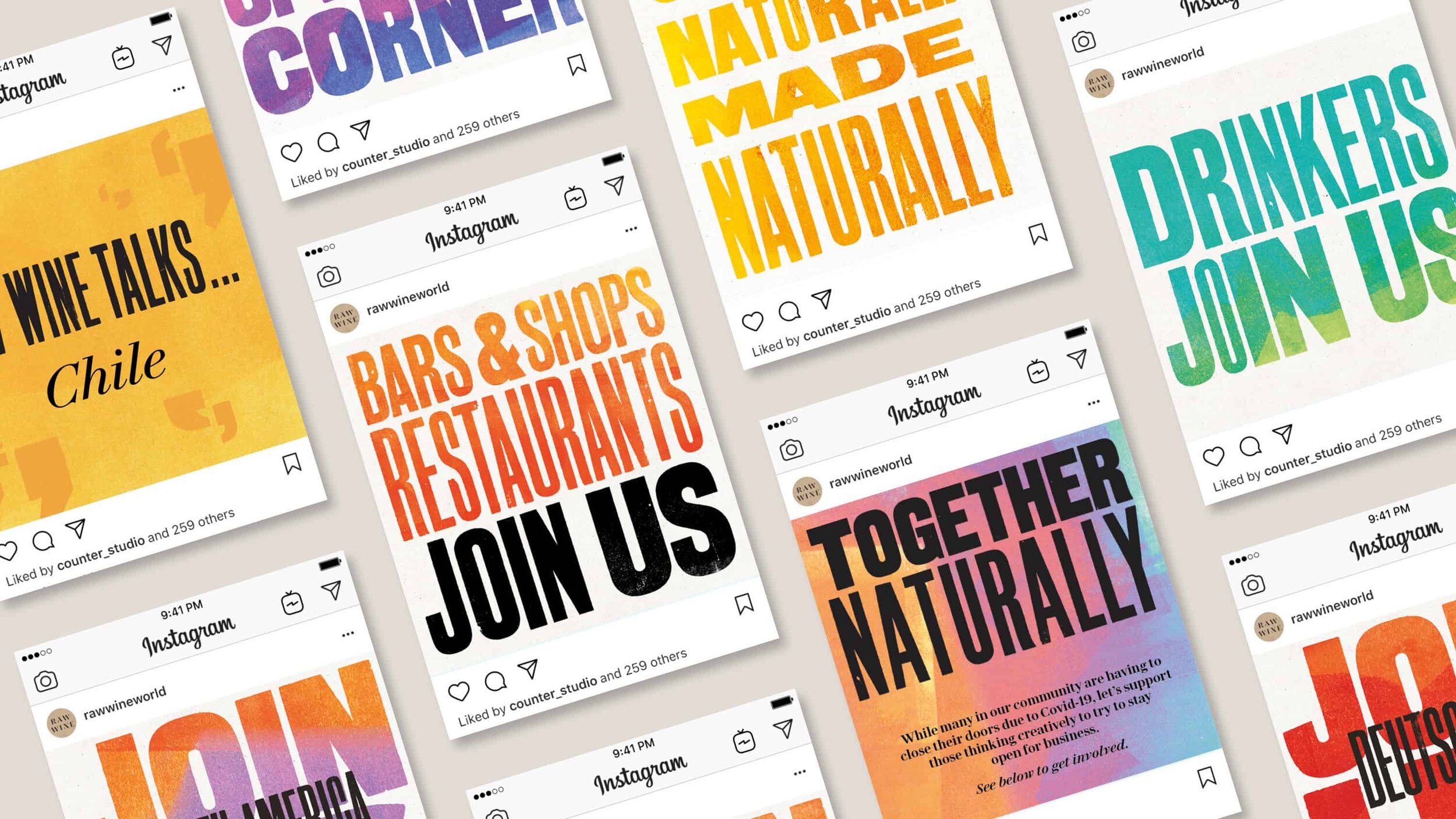
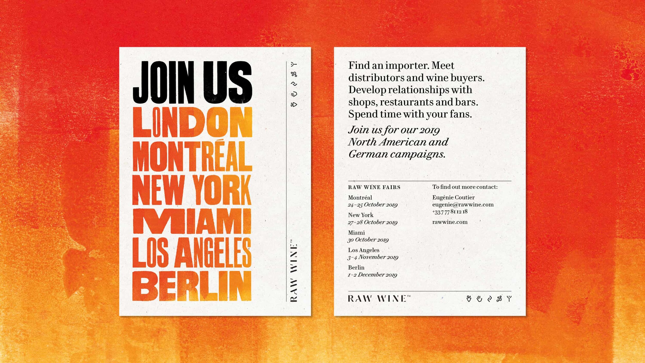
New vintages
We continue to work closely with Raw Wine, acting as brand guardians and evolving the visual language as the brand expands. No longer just a wine fair in London, Raw Wine now has a global presence, with fairs across America and Europe, and so each year we remix the brand to create a new campaign to unify all the fair locations. Although delivered across multiple platforms, it’s the posters that people love, becoming collectors’ items for the vibrant Raw Wine community.
More projects you might like

L’Atypique
A distinctive look for a distinctive cidre

Fourteen Drops
Establishing a high street hot spot

Bibendum
Relaunching an icon