
L’ATYPIQUE
Creating a distinctive new look for a distinctive new cidre
L’Atypique is not your typical cider (or even ‘cidre’), hence the name. A world away from the strong, head-spinning stuff, this organic zingy and refreshing fine French table cider is easy going and perfect with food.
With cider sales on the rise, L’Atypique needed to update its tired identity to help it stand out in a market growing market. We were tasked with creating a distinctive crafted look to match the distinctiveness of L’Atypique’s craft cidre.
Services
Brand identity
Packaging

An individual collection
Keen to reflect the age-old cider-making heritage of the artisan producers, and with a desire to align themselves with fine wines, the new look needed to feel both traditionally crafted yet also contemporary.
With four products in the range, our starting point was to develop a simple naming structure and visual hierarchy that would allow differentiation between flavours, yet work as part of a wider collection. By using soft colours and subtle texture changes, we created clear distinction between the standard apple and pear flavours and more sophisticated Limited Press range.


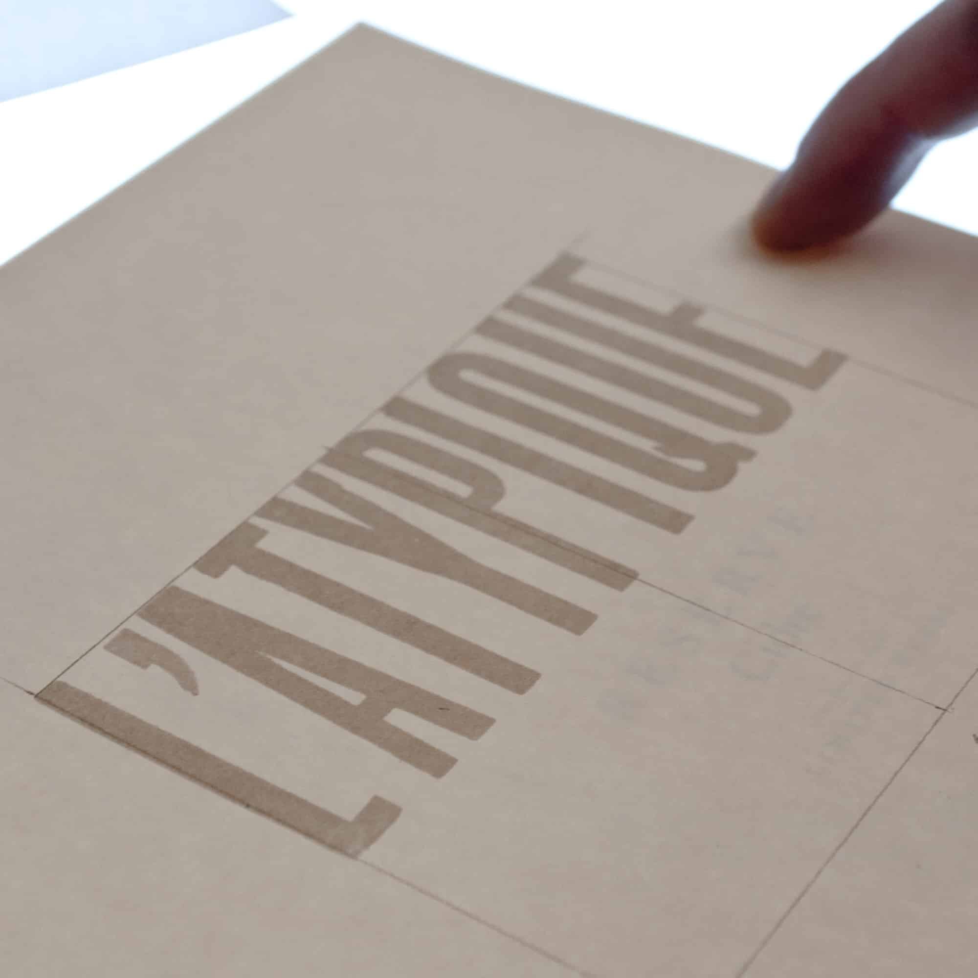

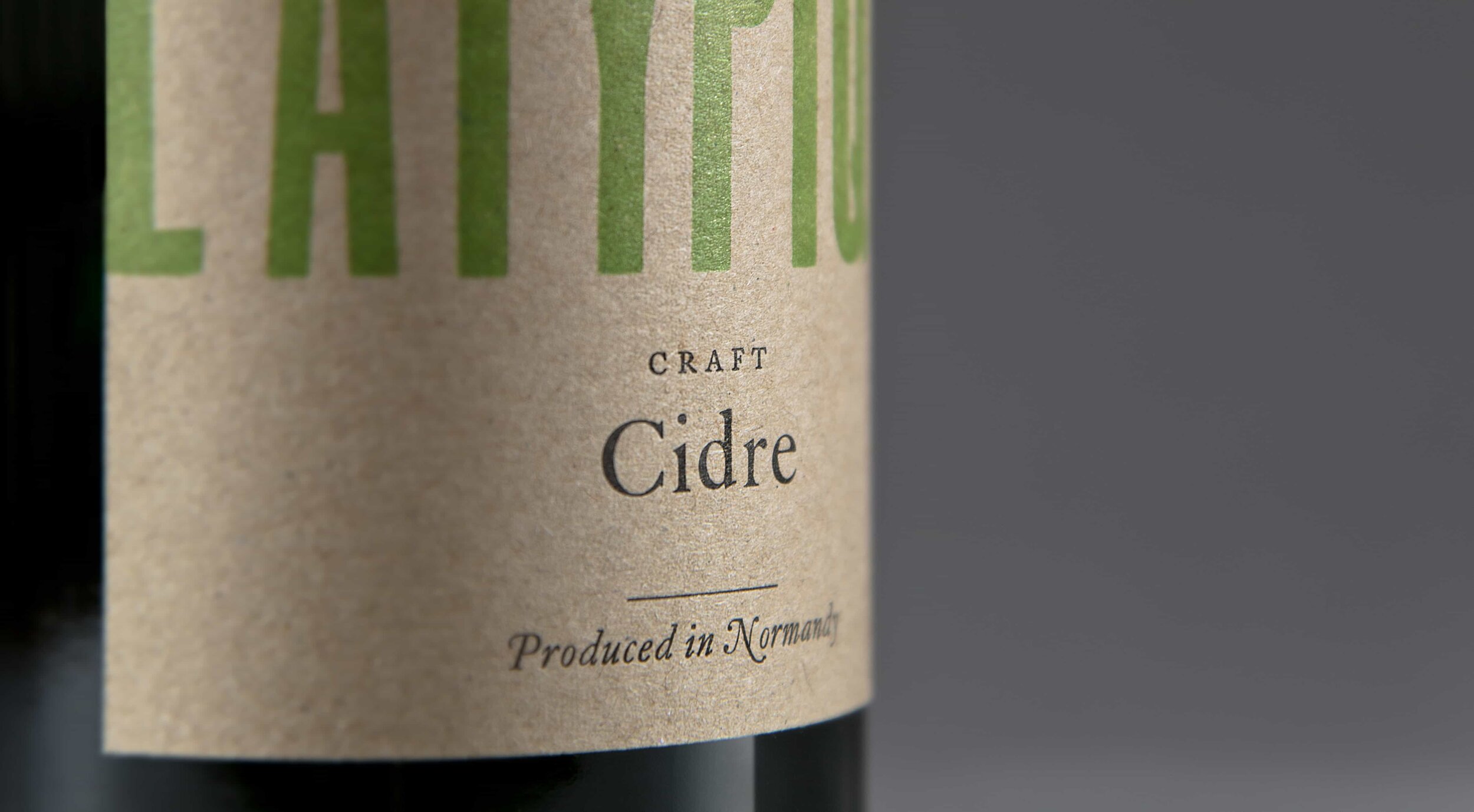
A truly crafted approach
To reflect the hand-crafted nature of the cidre, we created a new look for L’Atypique using traditional letterpress. The logotype that sits proudly across the top half of each label uses a distinctive ‘grotesque’ wood type, type set and printed by hand. Below, the details of each variety are set in a variety of crisp metal Caslon fonts.
Initially letterpress printed from original type, the artwork for each label has been digitised for wider use.

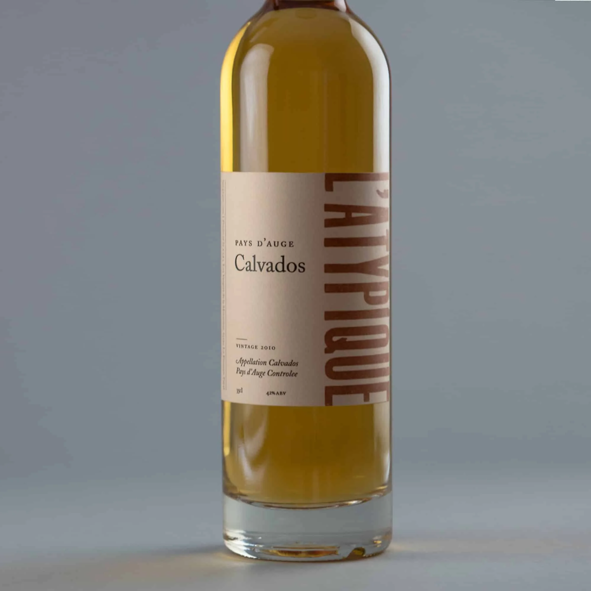
Expansion and growth
The new packaging saw L’Atypique sales and stockists increase significantly. The success of the cidre led to the range expanding to include a new line in Calvados.
Packaged in an elegantly slim bottle, smaller than the rest of the range, the Calvados needed to look like a premium spirit, while still feeling part of the L’Atypique family. With a simple rotation of the wood type logo, we created a sharp and sophisticated twist to the identity.

More projects you might like
Raw Wine
Refreshing the voice of natural wine

Fourteen Drops
Establishing a high street hot spot
Creating a brand in all senses