
ROVA
Vavavoom for dogs
Rova is a new health and wellness brand for dogs, all made with a dogs’ total well-being in mind.
Launching into a fiercely competitive market, we were tasked with developing a strategy, name and identity that would help the new brand stand apart.
Services
Strategy
Naming
Visual identity
Verbal identity
Bespoke logo
Packaging
Web design
—
Collaborators
Verbal identity & tone of voice—Ed Prichard

Cutting through the clichés
In a busy sector dominated with fluffy-wuffy dog-speak and tweed-and-welly brands, finding a way to navigate the clutter and cut through the doggy clichés was key.
Aimed at a newer, younger and more health conscious audience – who tend to think about their dog’s wellbeing as they think of their own – the brief was to develop a brand that could establish itself as a smart and assured new alternative.
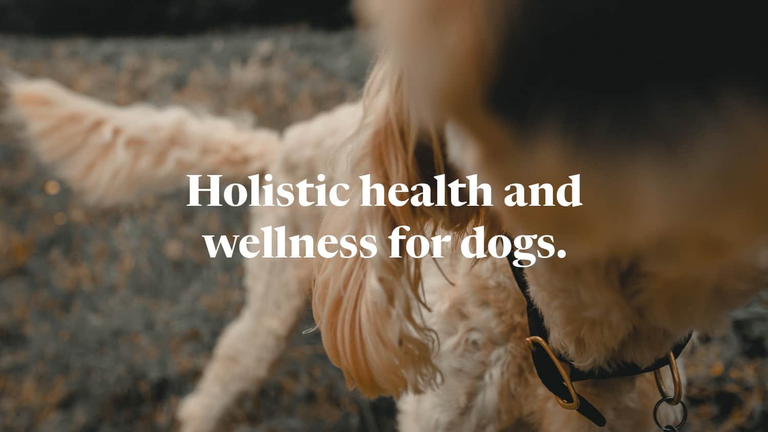
Wellness for dogs
The idea was simple: don’t create just yet another dog brand, instead build a smart new health and wellness brand – that happens to be for dogs.
This meant thinking about dogs’ health the way we think about our own: more holistically than just nice sounding recipes, treats and “walkies”.
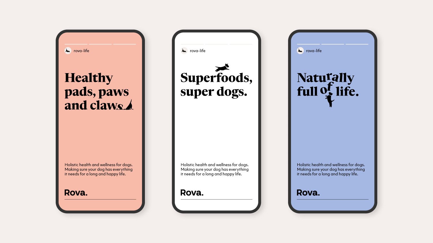
We developed a muted and restrained identity system – more Aesop than Pedigree Chum – but introduced an energetic tone of voice and endearing down-to-earth photography, with the addition of a lively character that brings small moments of mischief and playfulness. The aim was to develop a sense of calm reassurance without forgetting the joys of owning a dog.
By positioning the brand firmly in the owners lives and aligning it more to their lifestyle – rather than trying to appeal to what we imagine our dogs might be thinking – allowed us to quickly identify and cut through the category norms.
What’s in a name
Like a new puppy, the new brand needed a name.
We understood that both the name and identity needed to be simple and assured, and yet still capture some of the joy and playfulness that having a dog brings – something grown-up but which didn’t take itself too seriously. It’s a delicate balance.
Having explored many options and shortlisted three for development and testing, Rova was the clear winner. A simple and slightly tongue-in-cheek play on that classic – almost parody – dog name. Familiar yet different. And like the name it derives from it also has a sense of exploration, energy and exercise – themes that sit at the heart of the brand.
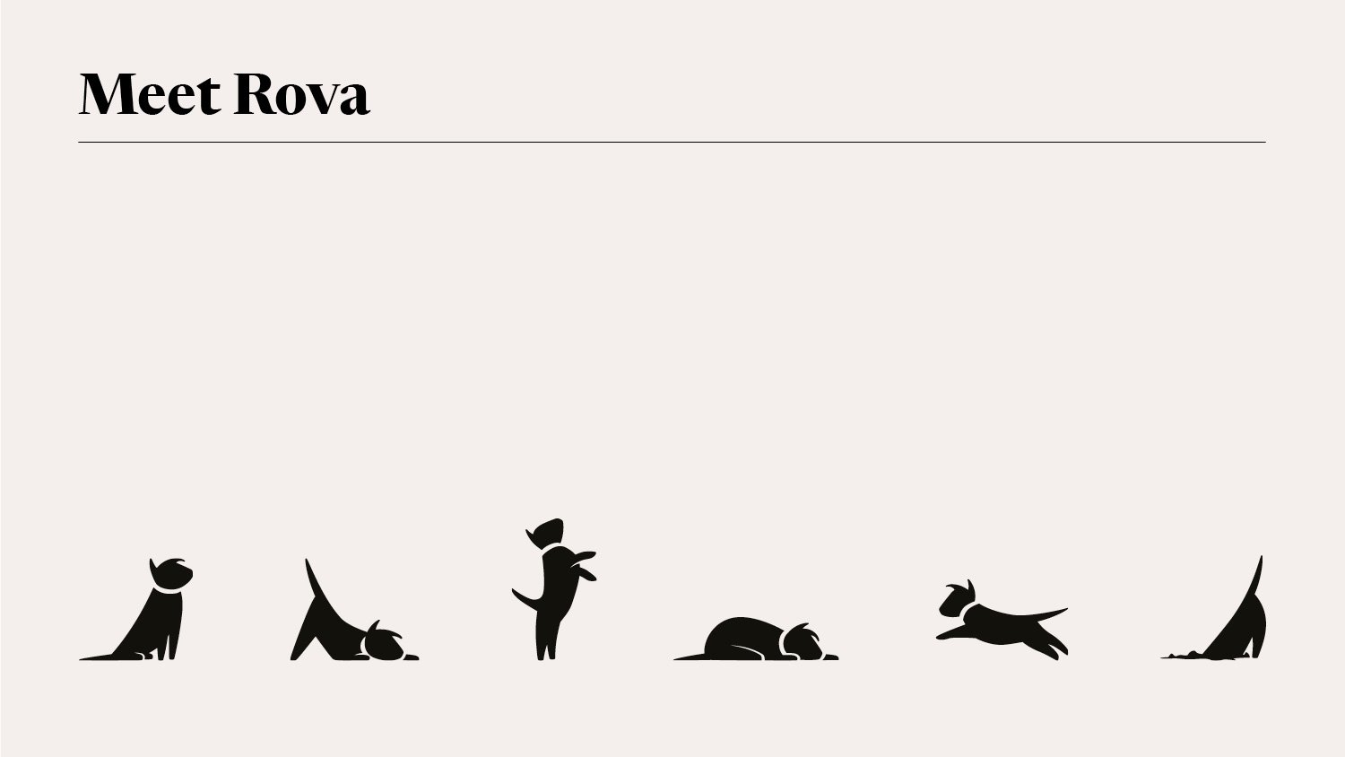
Bursting with the joy of life
The more muted and pared-back identity system needed a playful foil: meet Rova.
Designed as a deliberately small supporting character, rather than a front-and-centre caricature, Rova interacts with the identity elements, playing with type or appearing to respond to certain messaging, which brings an understated canine charm to the identity.


Freshly packed
Rova is a direct-to-consumer brand, sold exclusively through its own website. Without the need to fight on the shelf we could focus on making sure both the packaging and web experience were as uncluttered and simple as possible. Getting to the heart of what matters.
Launching with supplements, the fully recyclable packs balance the clean design ethos with the ever playful sign off in the form of Rova.


Bounding into life
The new brand reflects Rova’s approach to dog wellness, with the identity, language and photography all working to create a holistic experience across digital, packaging and print.
—
With thanks to 303 London for the pack photography

“Counter Studio were invested alongside us, always going the extra mile. Communication was excellent and always constructive; where they challenged our ideas, it made us better. We embarked on a journey together and the end result was something we couldn’t have anticipated at the start... We knew we had created something special.”
Steve Winter, Founder, Rova

More projects you might like

Atelier Ellis
Creating quiet beauty
Raw Wine
Refreshing the voice of natural wine

The British Hat Guild
An icon for an industry