TYPENOTES
A love letter to letterforms
TypeNotes is an independent journal that celebrates the best of typography and graphic design from around the world.
Launched by boutique type foundry Fontsmith, the aim of the magazine was two-fold: to inspire readers with great articles and to promote the Fontsmith font library, without feeling like a sales brochure.
Involved from its inception, we worked closely with the Fontsmith team and Editor Emily Gosling to shape the tone of TypeNotes, creating a magazine that has become a feature on designers’ bookcases.
Services
Editorial design
Art direction
Launch campaign
—
Collaborators
Publisher—Fontsmith
Editor—Emily Gosling
Print—CPI / Park Communications
First things first
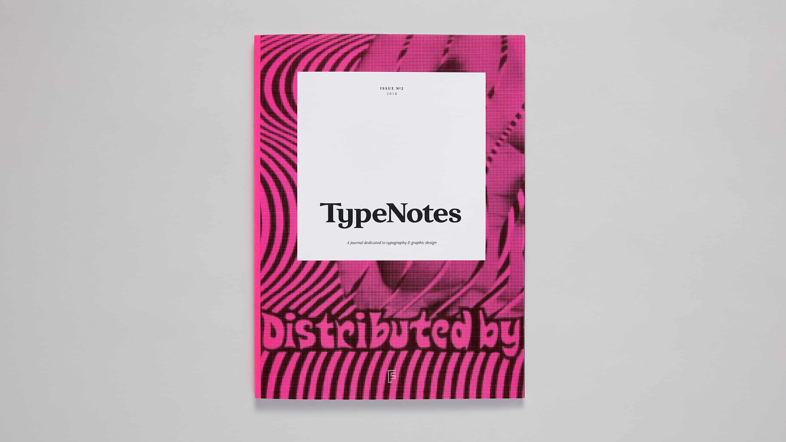
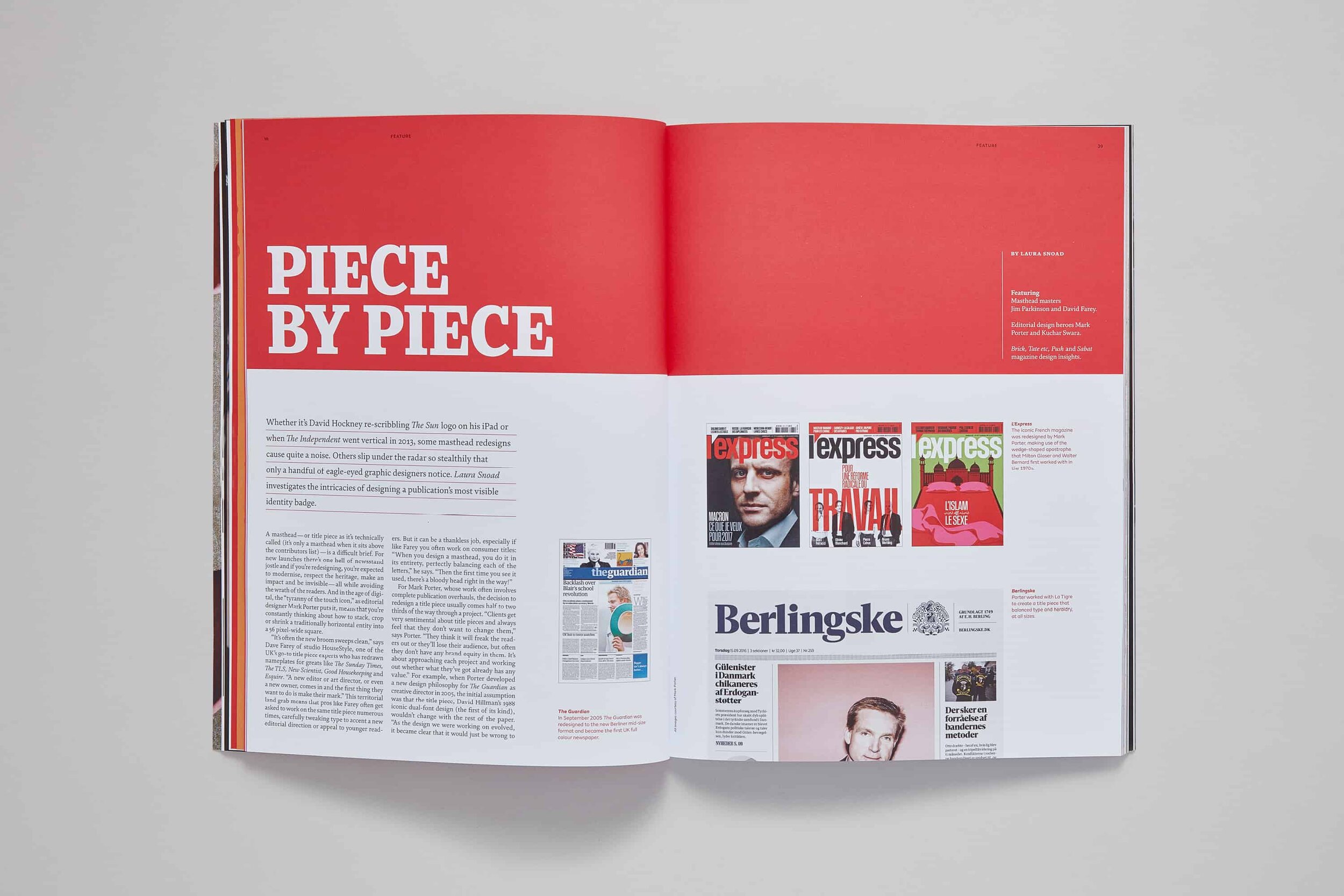
As the face of a type and design magazine, one of the first things we needed to create was a unique masthead* that would reflect TypeNotes’ personality and its focus on letterforms.
We worked with Jason Smith, founder of Fontsmith, to craft a bespoke piece of lettering specifically for the job—the result is a sharp, smart serif design that doesn’t take itself too seriously, the prefect introduction to TypeNotes.
—
*Or a title piece as its technically known (it’s only a masthead when it sits above the contributors list, as Laura Snoad wrote in an article in issue 2.)

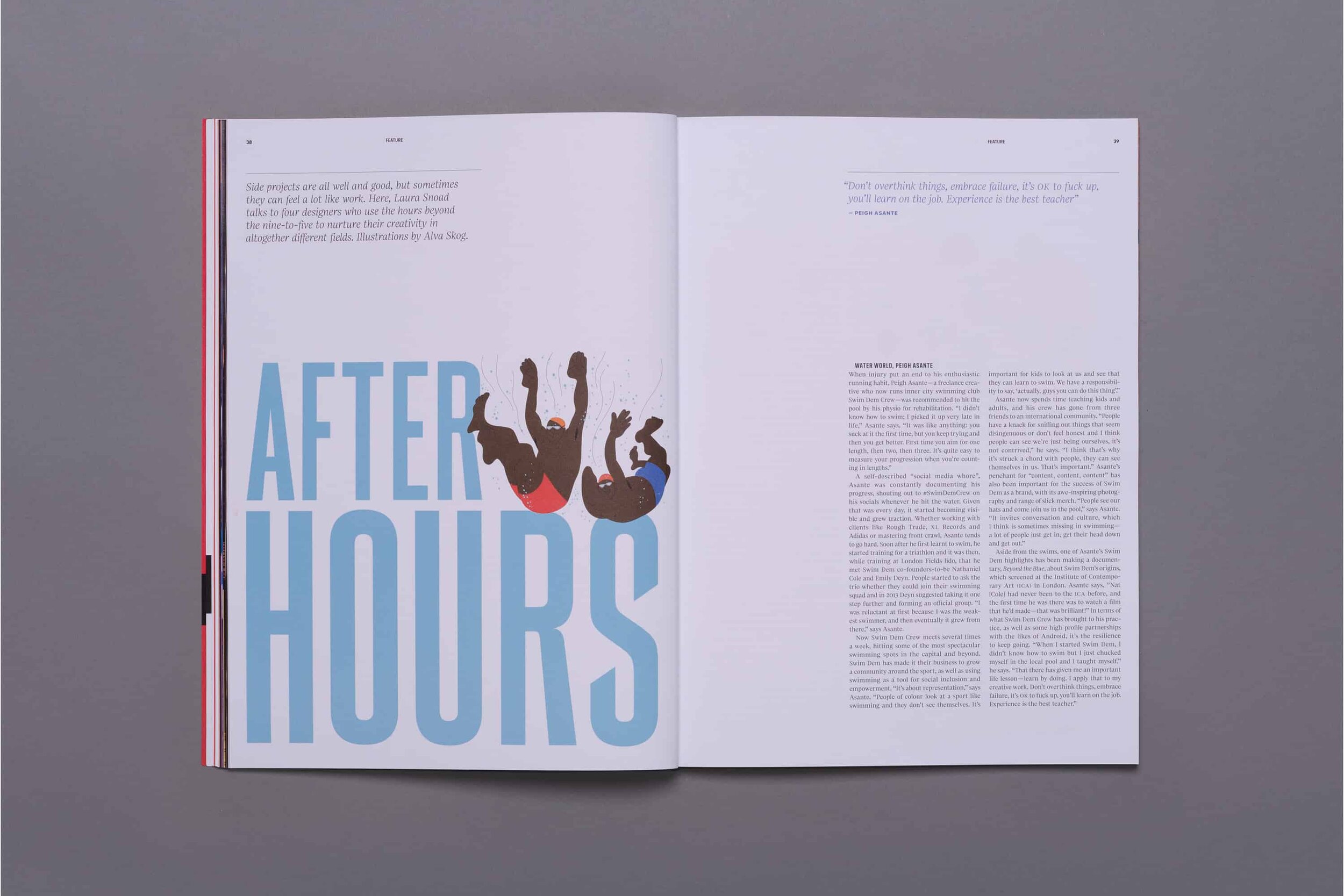
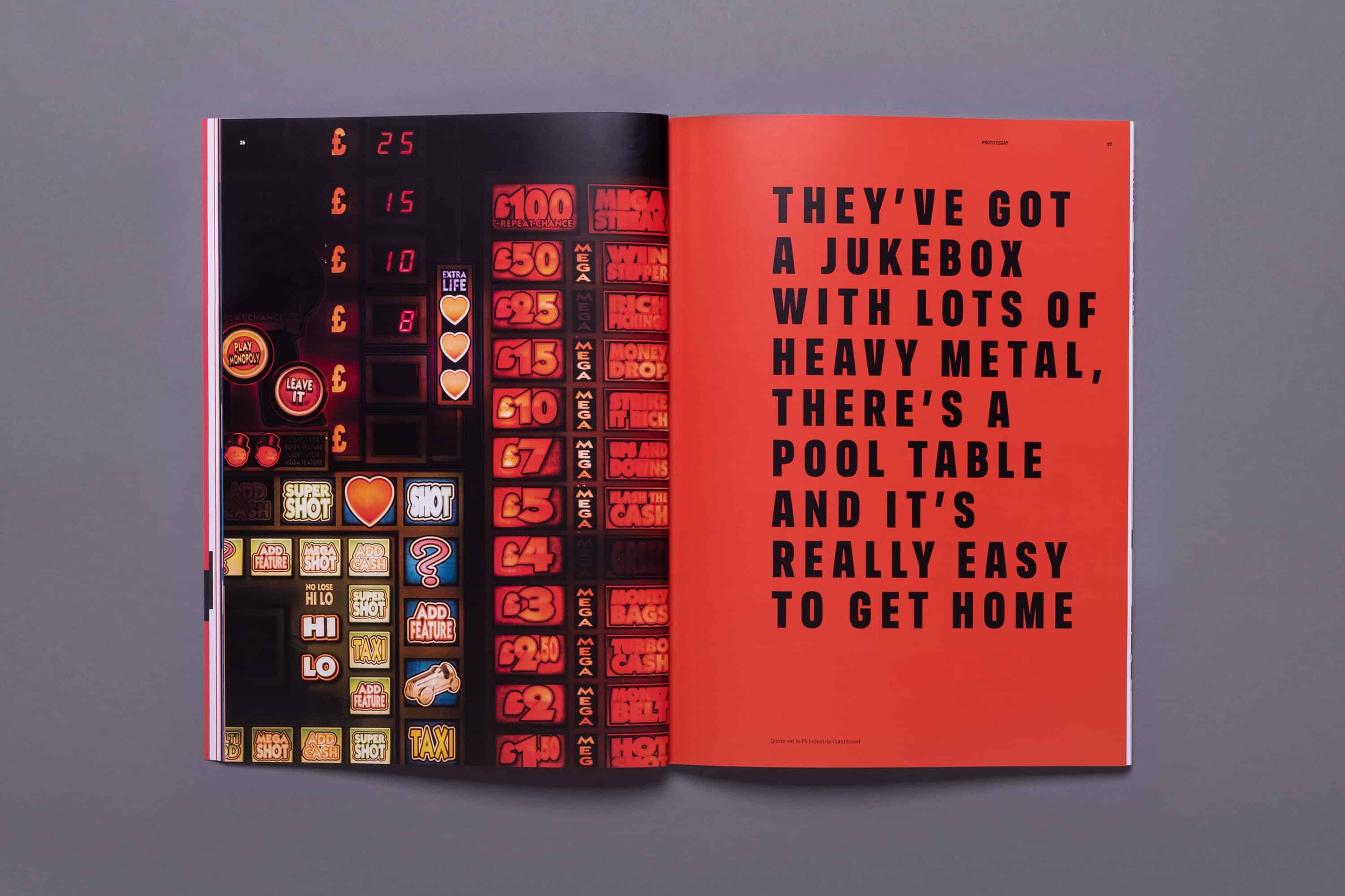
A light approach to eclectic content
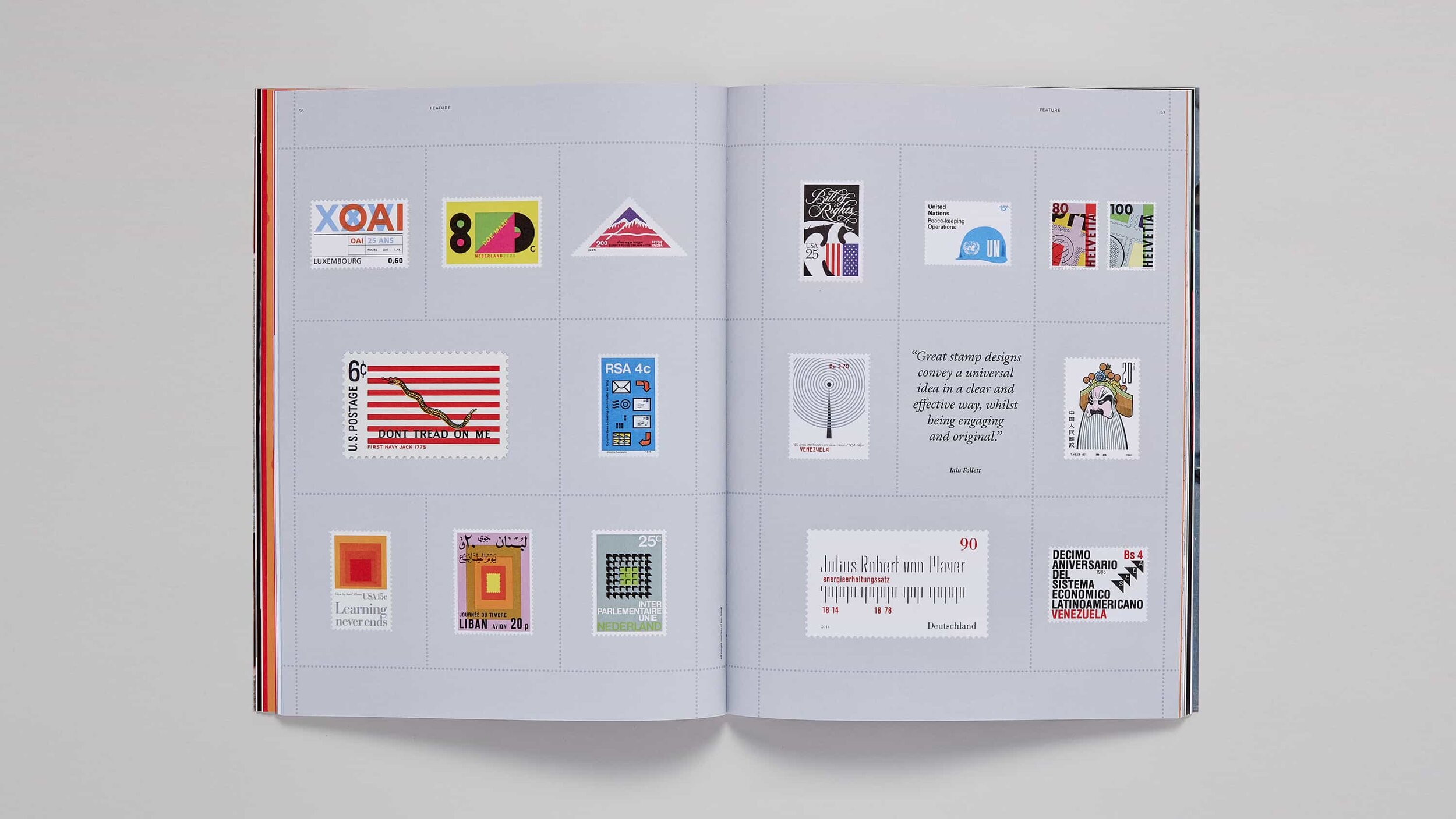
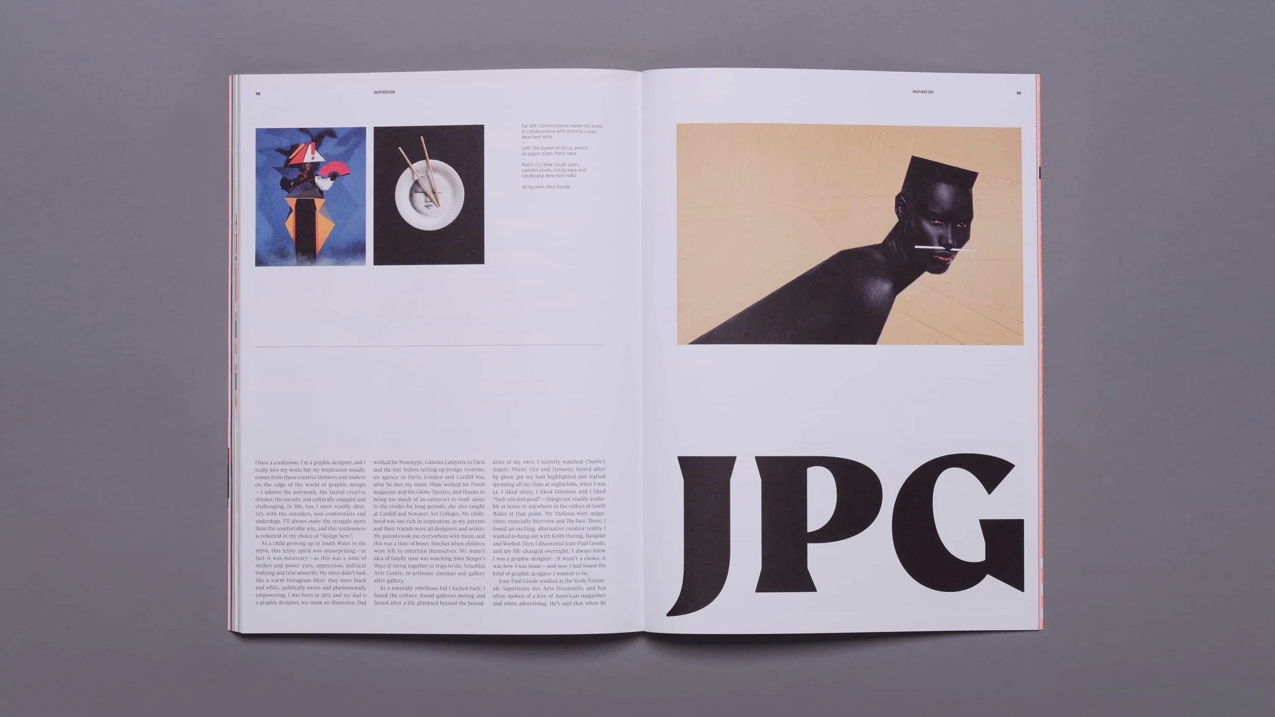
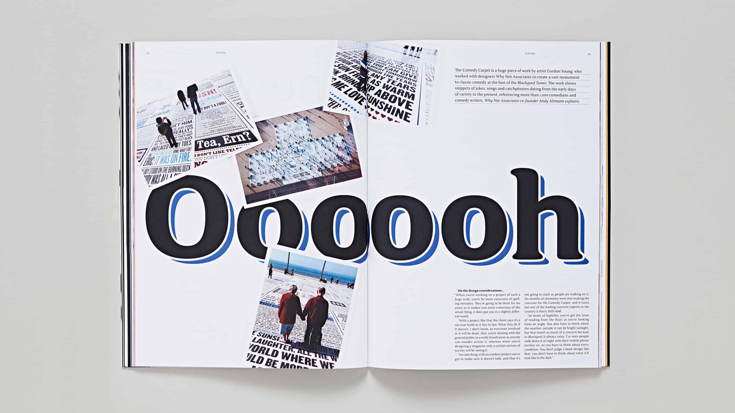
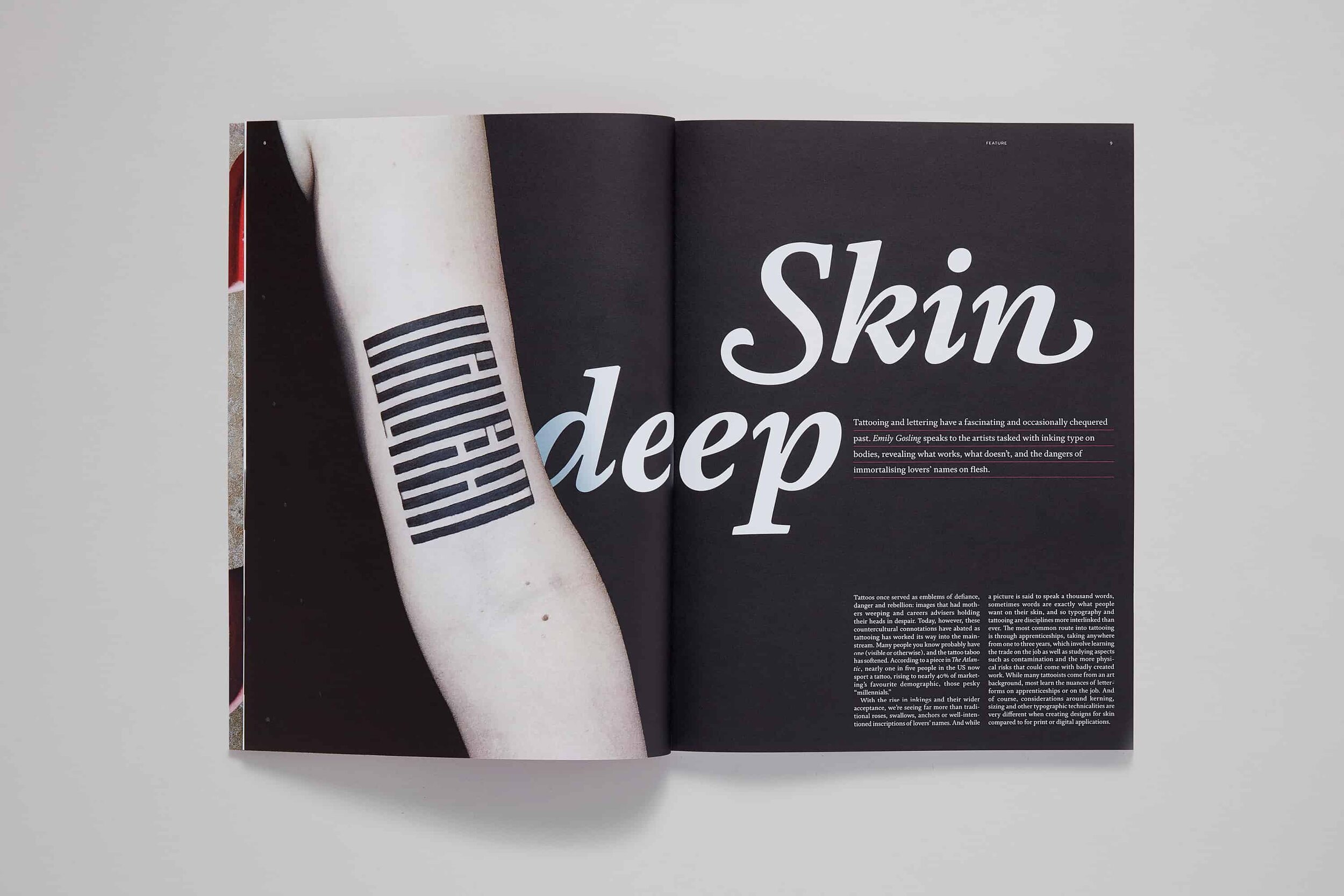
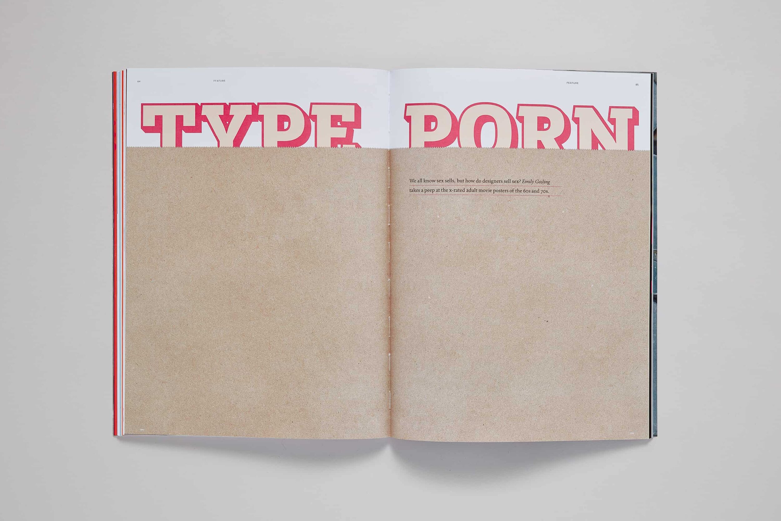
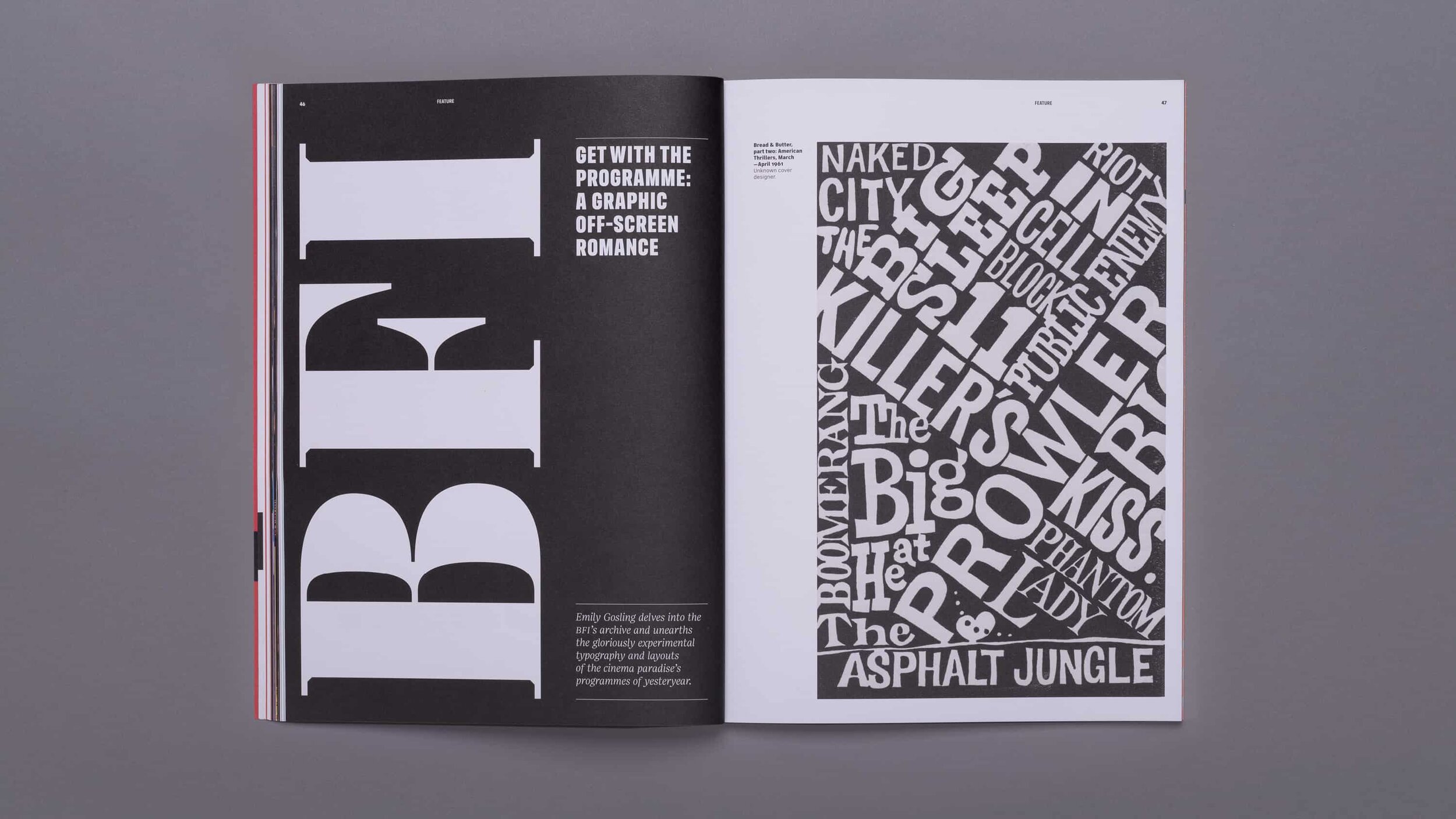
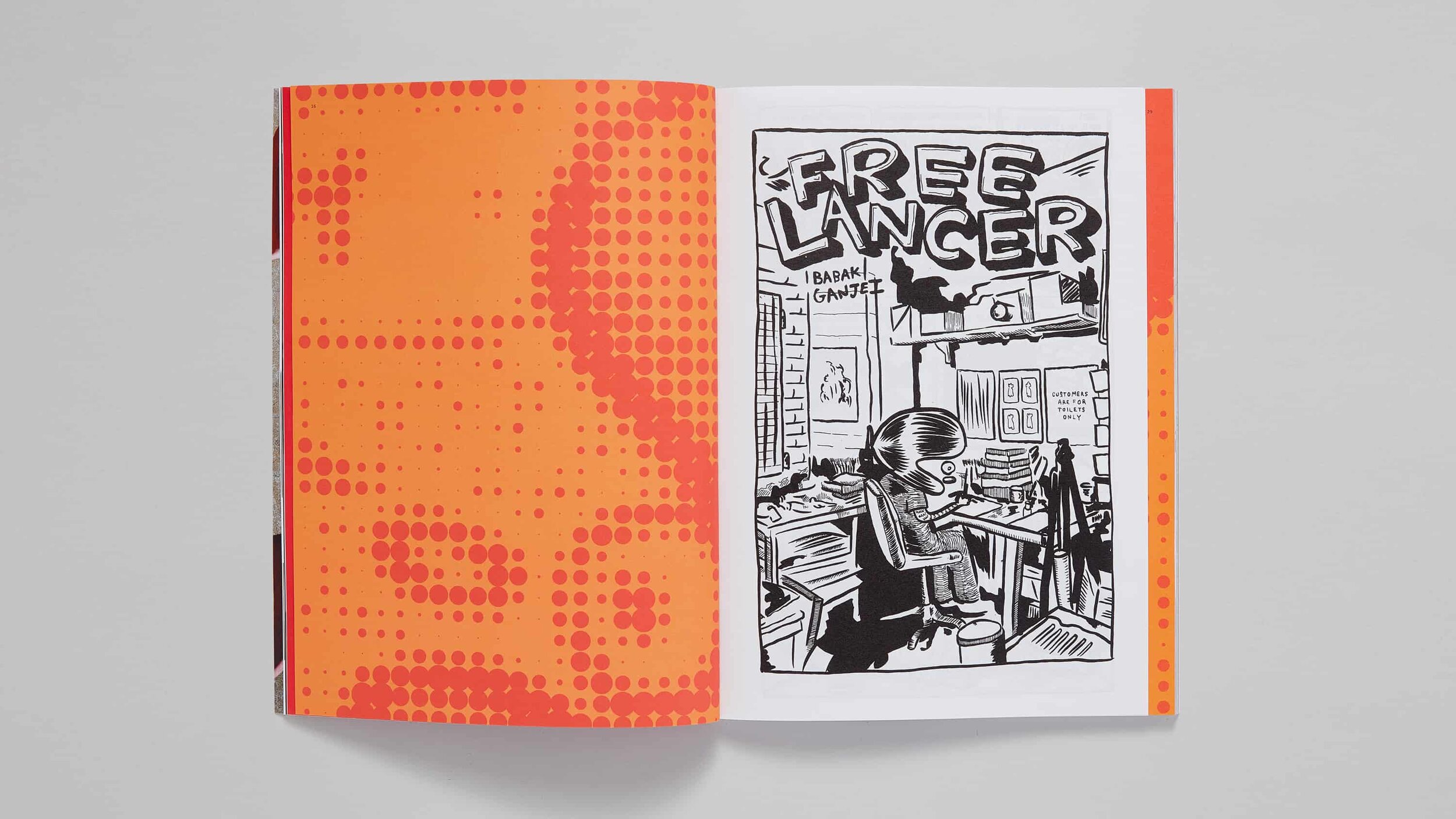
Each issue featured contributions from industry stalwarts, as well as newer agencies, and covered everything from the nuances of drawing type to inspiration in the form of cassette cover artwork, beer mats, and the mad men of Madison Avenue, meaning there was something for everyone with even a passing interest in graphic design.
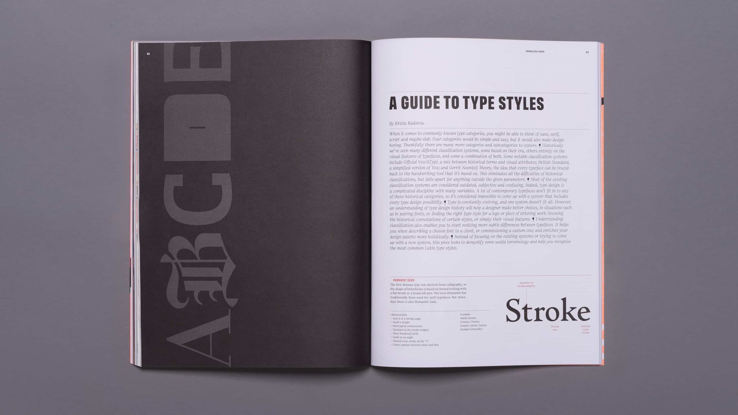
From the start, we knew that with such varied content and a large library of fonts at our disposal, we’d need to create a design that was flexible yet simple and sophisticated enough to allow the articles and type to shine.
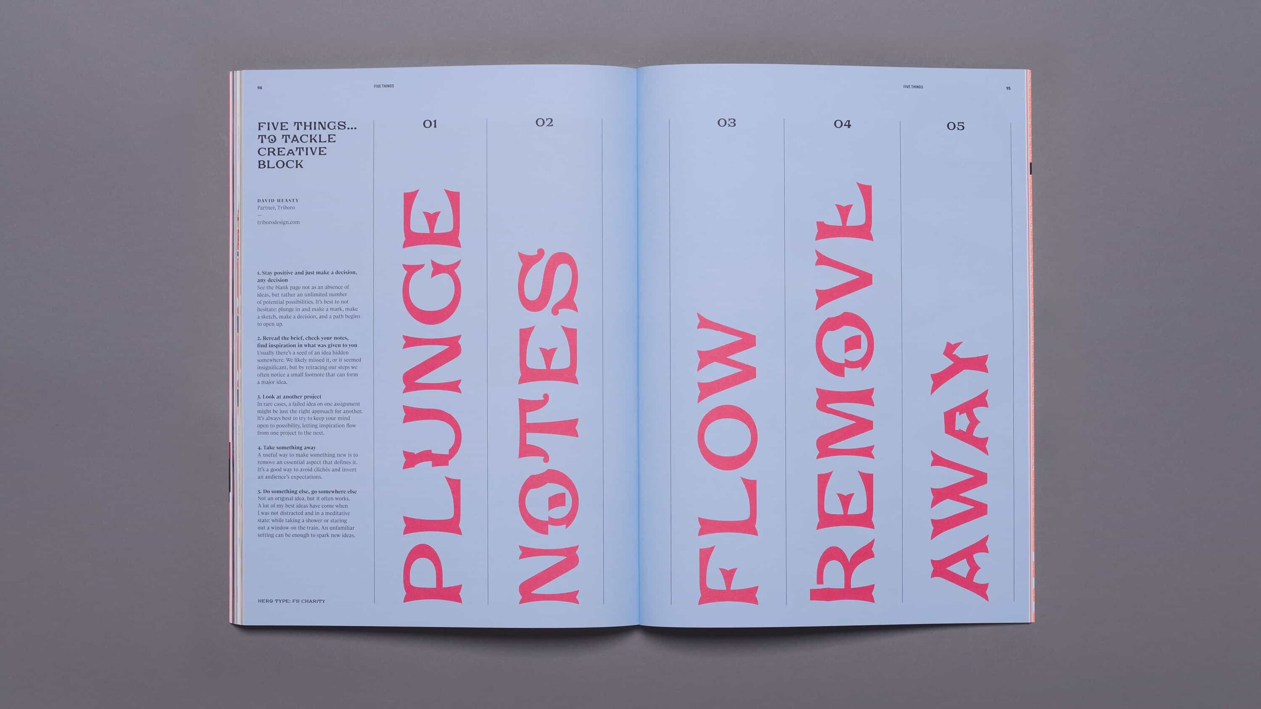
A simple, structured grid and underlying system builds a consistency and cohesion to layouts, while allowing plenty of creative variation—letting the fonts to show off their character and detail.
Divider and introduction pages allowed us to hero newly realeased fonts as well as highlighting older fonts buried in the archive—bringing articles to life but, crucially, never overpowering the content.
“I’d like to thank Counter Studio for yet another exceptional piece of design work.”
Jason Smith, Founder and Publisher
Feeling like a good read
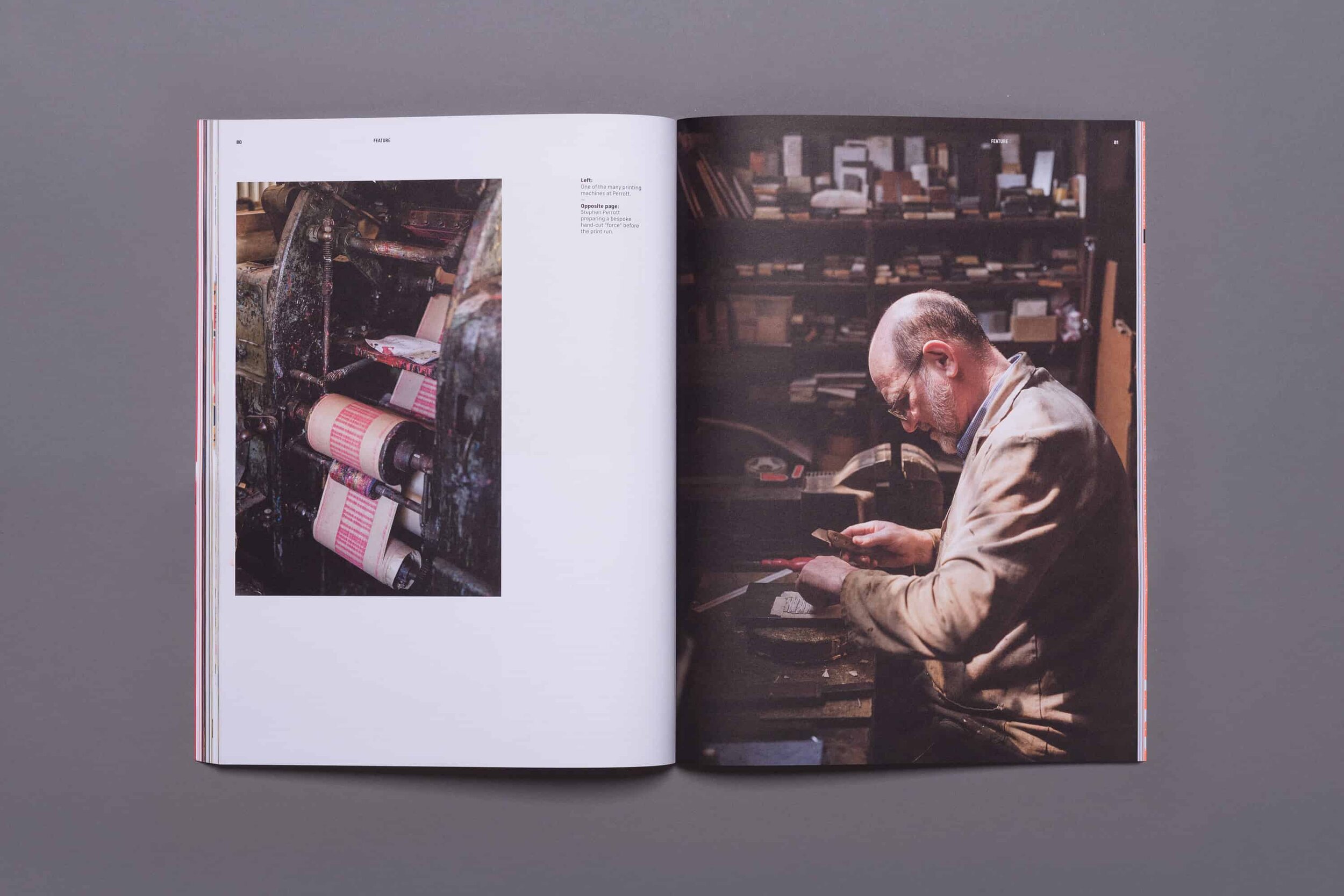
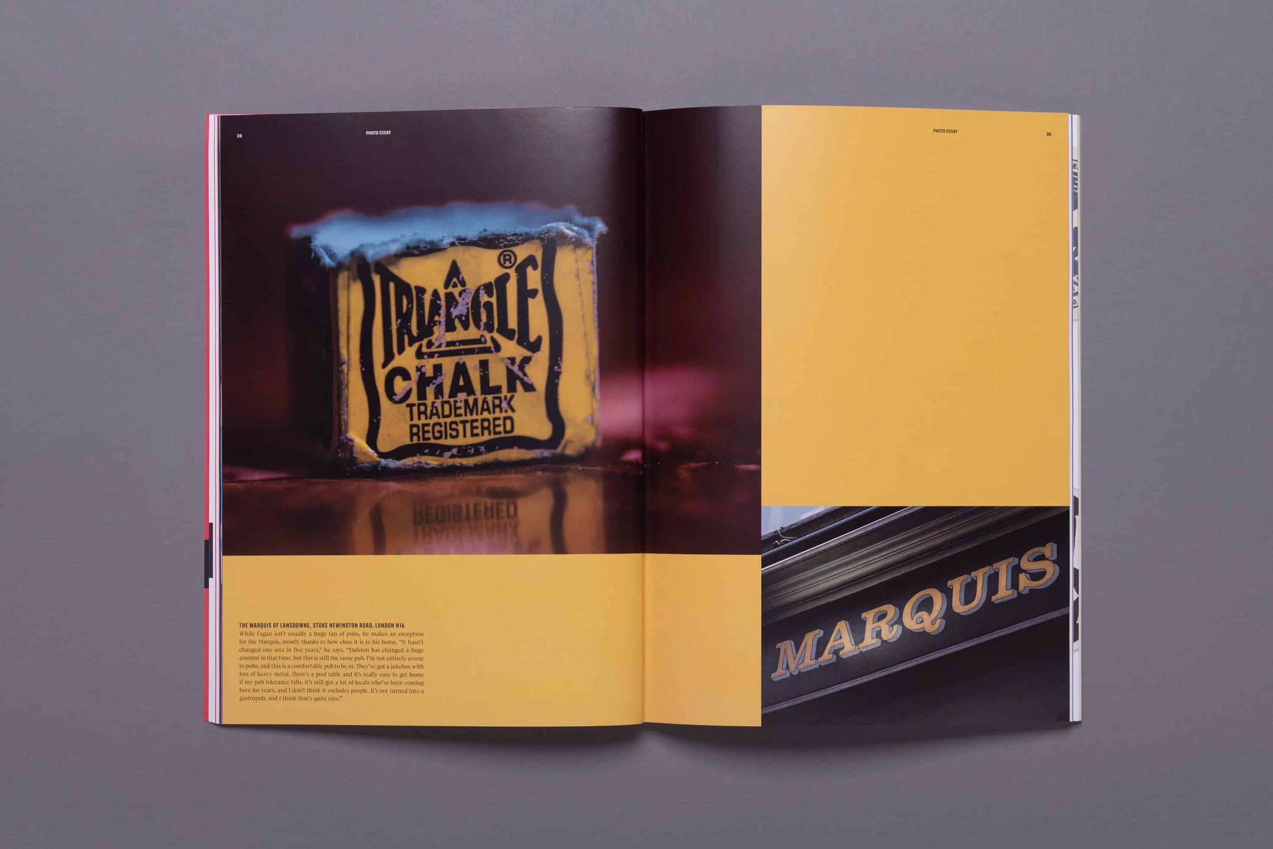
We added variety to the format itself by using different paper stocks for different sections—from rough and thin for a comic book stitched into the magazine to luxury high-gloss pages for photography sections.
Ultimately the aim was to create something that was enjoyable to both hold and read—a celebration of print as well as design.
Read all about it
A hit with the design world, the first issue of TypeNotes completely sold out in the first few weeks and issue two won a Merit at the HOW International Design Awards.
Each issue received great reviews, but this from Creative Bloq is perhaps our favourite… “Fontsmith’s new typography and design journal executes a thrilling sucker punch with its first two issues.”